Designing a Telemedicine Platform from Discovery to Launch
The Problem Worth Solving
A large Southeastern health system had a vision: bring virtual healthcare directly into schools across the Carolinas. Kids who needed medical attention during the school day shouldn't have to leave school and wait hours at a clinic. A telepresenter (a trained healthcare worker on-site at the school) could connect the student with a remote provider via a tablet-based telemedicine app, delivering care in minutes instead of hours. The program had already proven the model — 28,500+ virtual visits, 18,000+ unique patients, 170 schools across 8 districts — but the technology hadn't kept pace with the growth.
The concept was clear. The design challenge was enormous: this wasn't one app for one user. It was a coordinated system serving four distinct user types, each with completely different contexts, tasks, and mental models.
It was also one of those rare projects where the mission was impossible to ignore. The people on the client side genuinely believed in delivering that last-mile healthcare to kids who otherwise wouldn't see a doctor. That conviction shaped everything—the urgency in design reviews, the willingness to iterate, the shared sense that getting this right actually mattered.
The Users (and Why Each One Mattered)
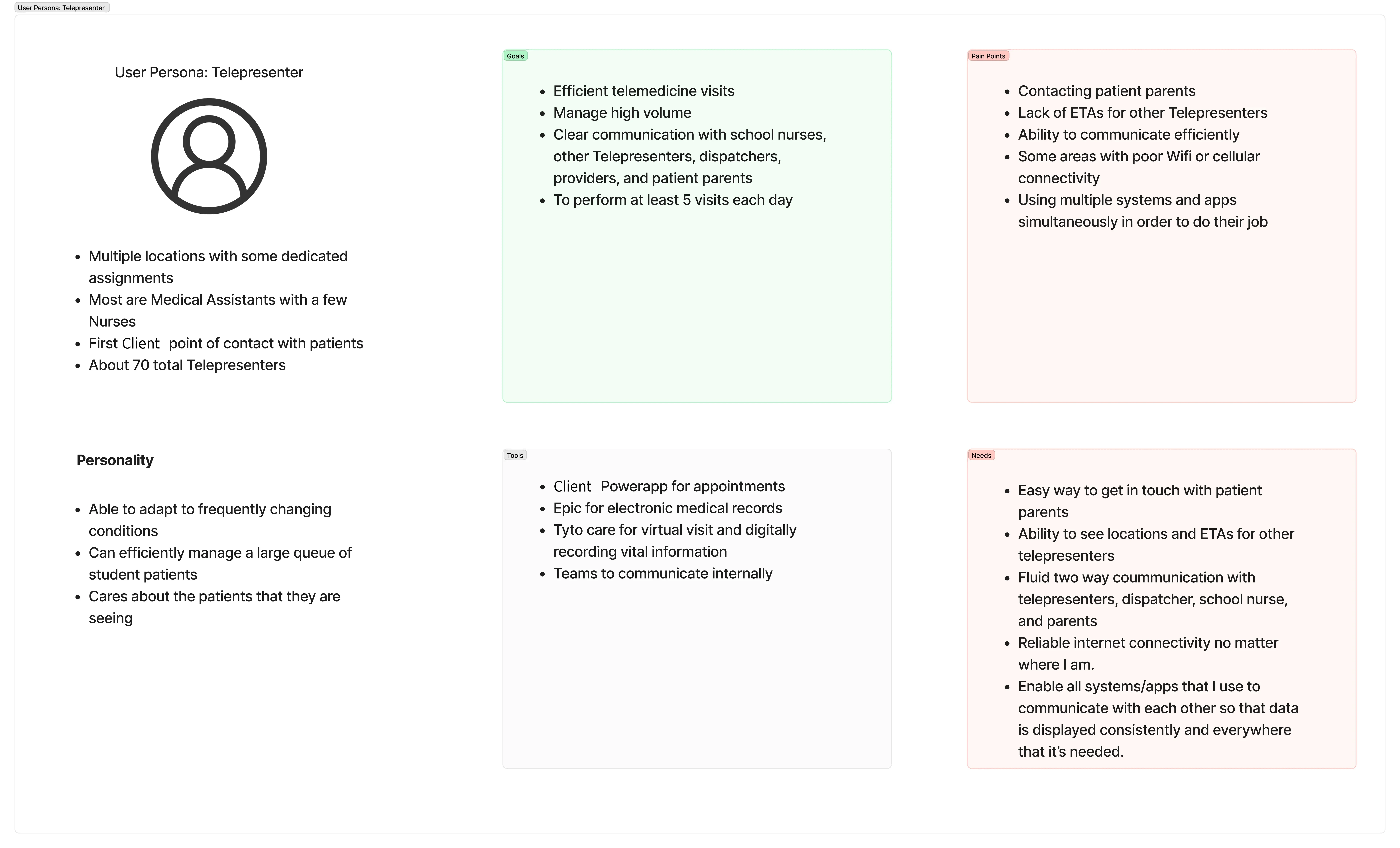
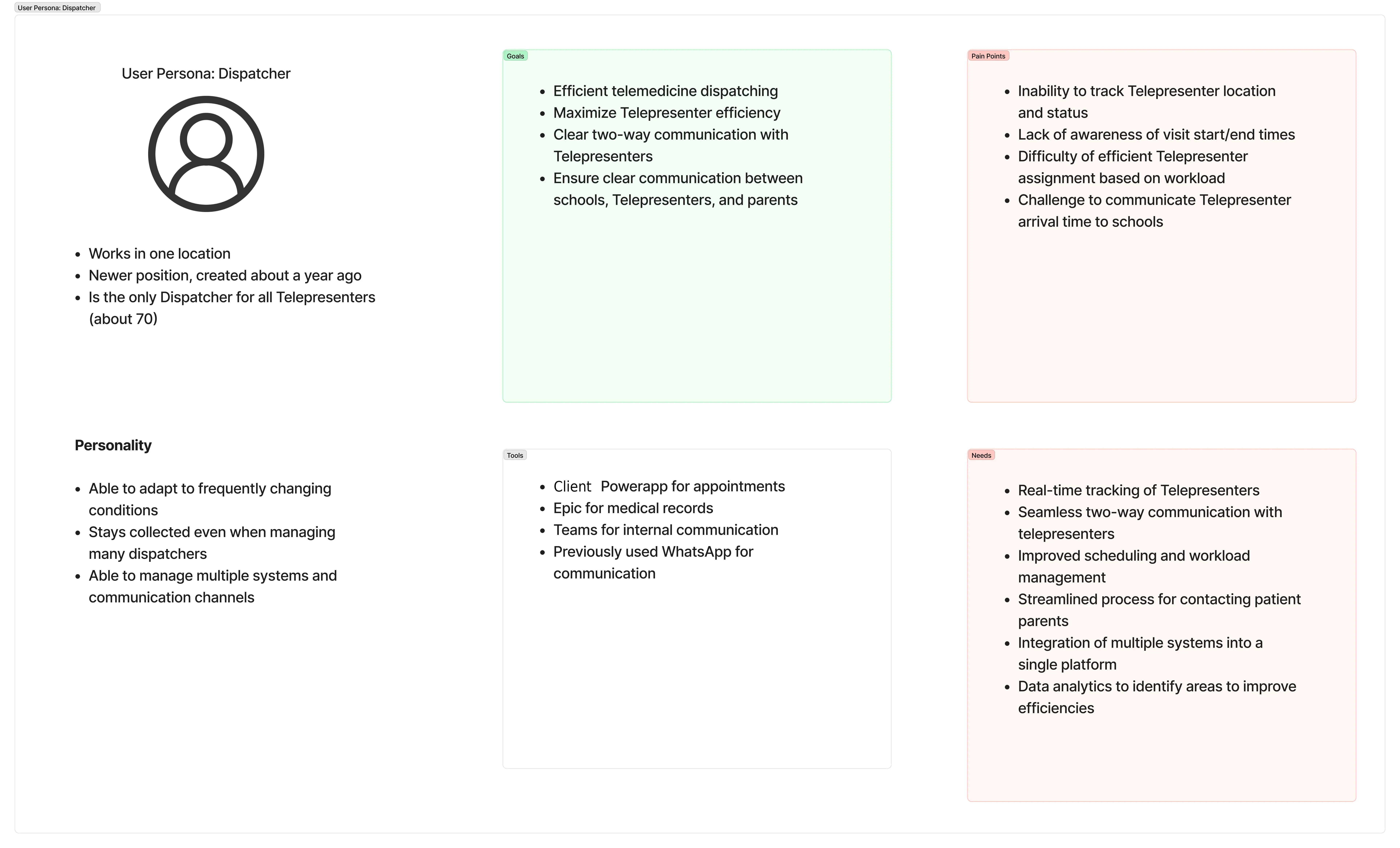
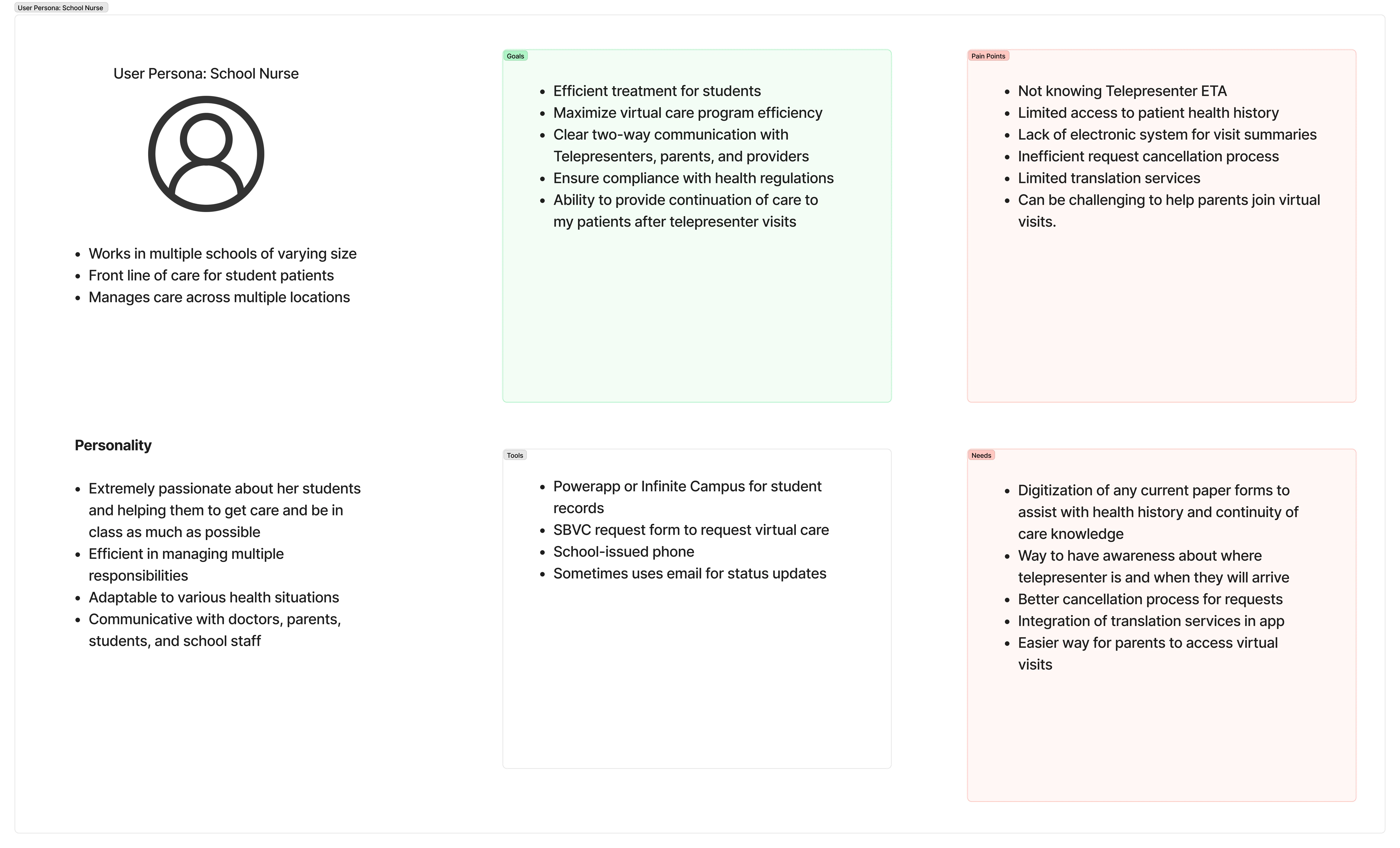
I led user research — interviews with telepresenters, school nurses, and dispatch coordinators, plus contextual observation of similar workflows in clinical settings — to define three primary personas:
The Telepresenter is on-site at the school. They're the human bridge between the patient and the remote provider. Their context is physical and immediate—they're in a room with a sick kid, managing a tablet, taking vitals, and relaying information. Their app needs to be calm, sequential, and almost impossible to get lost in.
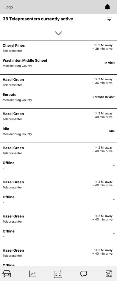
The Dispatcher sits in a coordination center, managing multiple telepresenters across multiple schools. They need a bird's-eye view: who's available, who's on a visit, which schools have pending requests. Their interface is a map and a queue—a real-time operational dashboard.
The School Nurse is the clinical backstop. They may not be in the room, but they need to track visits, review outcomes, and maintain continuity of care. Their needs are more retrospective—records, messages, follow-ups.
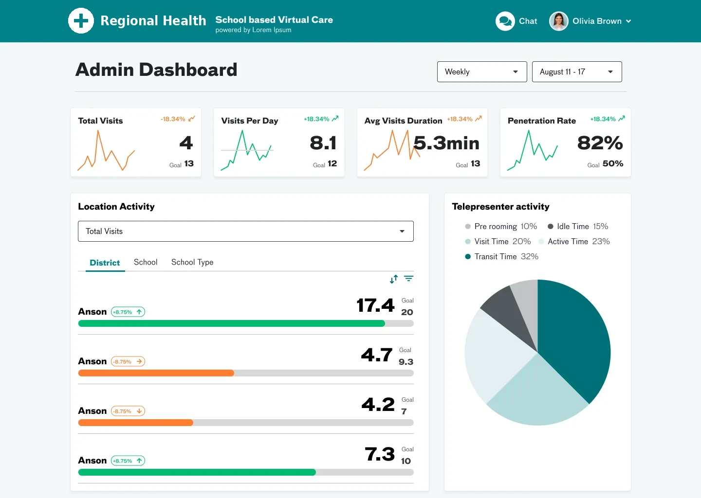
I also designed an Admin Dashboard for program leadership to track metrics, manage telepresenter assignments, and monitor system health across the network.
How I Designed It
Journey Mapping First
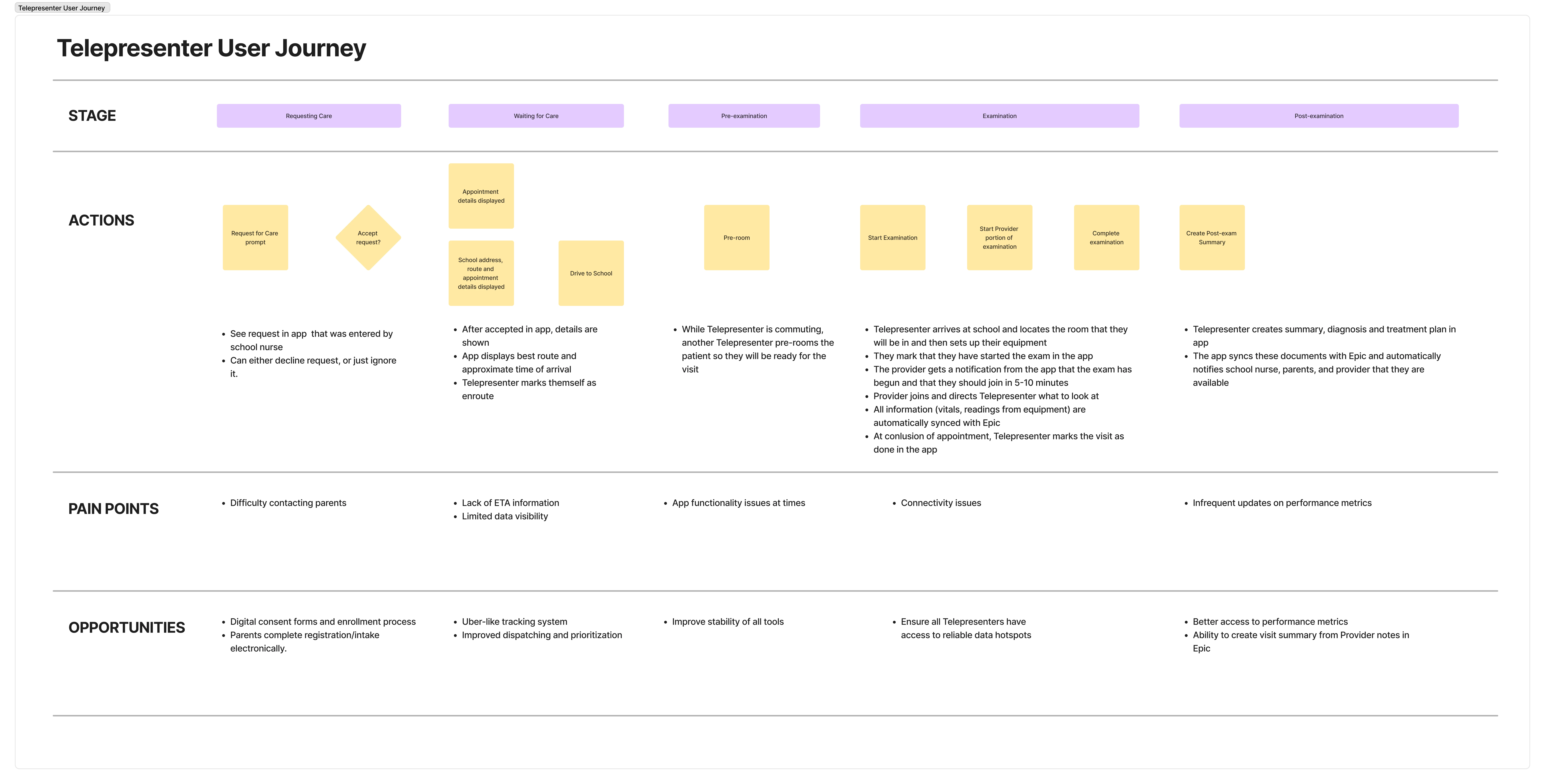
Before touching a screen, I mapped the complete journey for each role — every touchpoint from "school nurse identifies a student who needs care" through "visit complete, records updated, parent notified." These weren't abstract exercises; they were working documents reviewed with the client's clinical and operations teams.
The journey maps surfaced a critical insight that reshaped the entire design approach: the highest-risk moments weren't within any single role's workflow — they were at the handoff points between roles. The dispatcher-to-telepresenter handoff needed to be seamless. The telepresenter-to-nurse handoff needed clinical detail without turning the telepresenter into a data entry clerk. Once we identified handoffs as the primary failure mode, every screen design was evaluated against one question: does this make the next person's job easier?
Designing for the Telepresenter
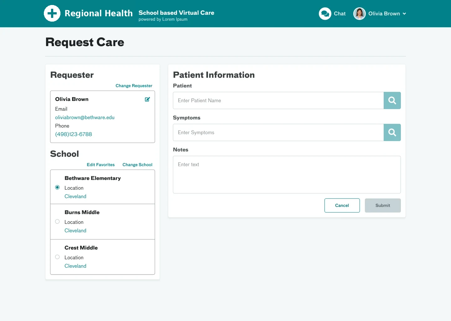
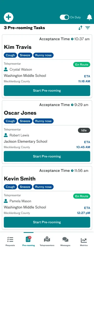
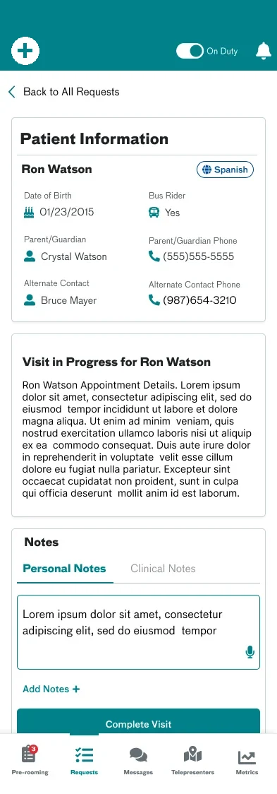
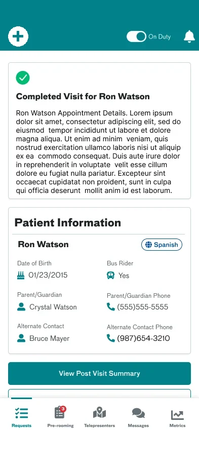
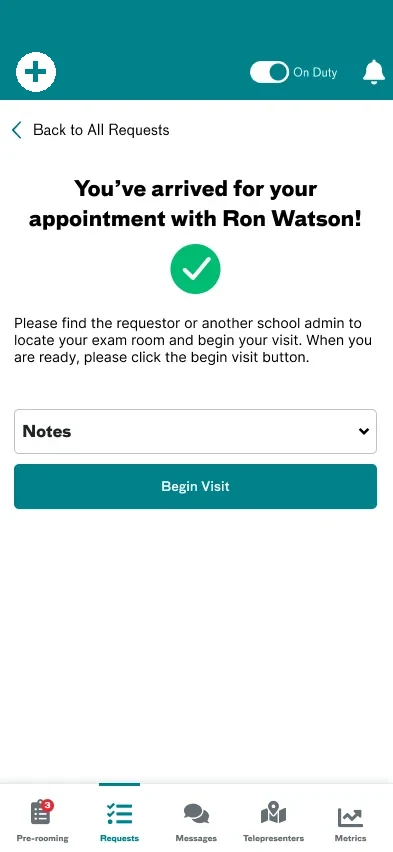
The telepresenter app was the most challenging surface. This person is physically with a patient, managing a tablet, and potentially stressed. I designed a linear, step-by-step flow: Request Care (patient info, symptoms), Pre-rooming (guided checklist), Visit in Progress (video consultation), and Visit Complete (summary, handoff). Large touch targets, minimal typing, clear progress indicators throughout.
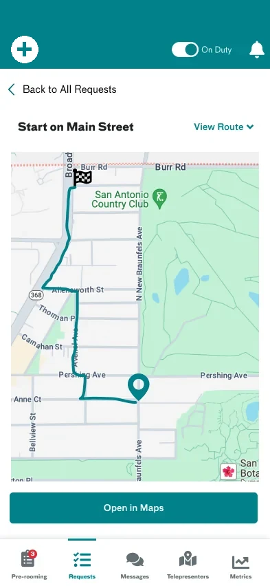
I also designed the driving/arriving states—when a telepresenter is en route to a school, the app shifts to a navigation-focused mode, then transitions to the clinical flow when they arrive.
Designing for the Dispatcher
The dispatcher interface is fundamentally different—it's a command center. I designed it around a map view showing all active telepresenters across the region, with a list view for managing the request queue. The dispatcher can see at a glance: who's available, who's on a visit, who's driving to a school.
The Messaging Layer
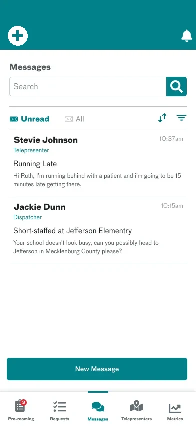
I designed a messaging system that connects telepresenters, nurses, and dispatchers within the context of a visit—so conversations are always tied to a specific patient encounter, not floating in a generic chat. This keeps communication focused and creates an audit trail.
What Made This Project Different
Most design projects involve one user type using one interface. This required a coherent ecosystem — four users, four contexts, four interfaces, one workflow. Actions in one interface had to trigger the right updates in every other. The system had to feel like one product, not four separate apps. The scale made this real: a single dispatcher coordinating ~40 telepresenters across 170 schools, each telepresenter covering 26–27 schools in their region, targeting 5 visits per day. The platform launched into pilot across the Carolinas, with a design that scaled from a single telepresenter serving one school to a coordinated network spanning 8 districts.
What I Learned
This project deepened my conviction that the most important design decisions in a multi-user system happen at the boundaries—the moments where one user's workflow hands off to another's. Getting the screens right within each role is important, but the handoff points are where the system either feels integrated or falls apart.
It also reinforced a principle that's guided my career: design the service, not just the software. The telemedicine app is only one component of a healthcare delivery system that includes human relationships, clinical protocols, school policies, and parent expectations. The best interface in the world fails if it doesn't respect the service it's embedded in.