Redesigning Provider Search for 600K+ Patients
The Problem Worth Solving
Finding a doctor shouldn't feel like a research project. But for Rochester Regional Health's 600,000+ patients across western New York, that's exactly what it was. The existing provider search dumped users into walls of text with minimal filtering and no visual hierarchy. Patients couldn't compare providers, couldn't filter by what mattered to them, and frequently gave up and called the contact center instead. RRH brought us in to rethink how patients discover and choose providers across the entire digital ecosystem.
What Made This Hard
Provider search looks like a straightforward list page, but underneath it's a tangle of competing needs. Patients search differently depending on context: some know exactly which doctor they want, others need a specialist near home who takes their insurance, and others start with a symptom and need guidance toward the right provider type. One interface has to handle all three.
The data compounds the challenge. Provider records come from credentialing systems that weren't designed for consumer search — specialties overlap, a single provider might practice at four locations, and availability data is never perfectly real-time. And patients in a regional system think geographically, which means map-based and list-based search need to coexist seamlessly.
How I Approached It
Starting with the Card
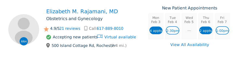
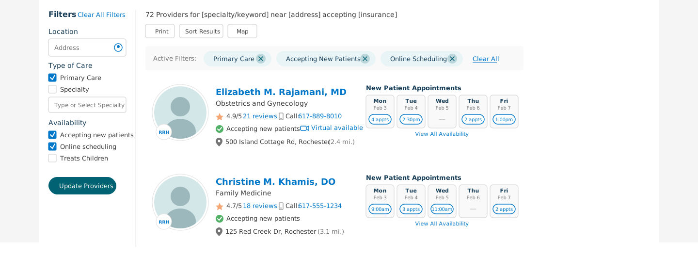
Rather than designing pages, I started with the atomic unit of the search experience: the provider result card. This is what patients scan dozens of times per search, and it has to communicate the right information at the right density to support rapid comparison.
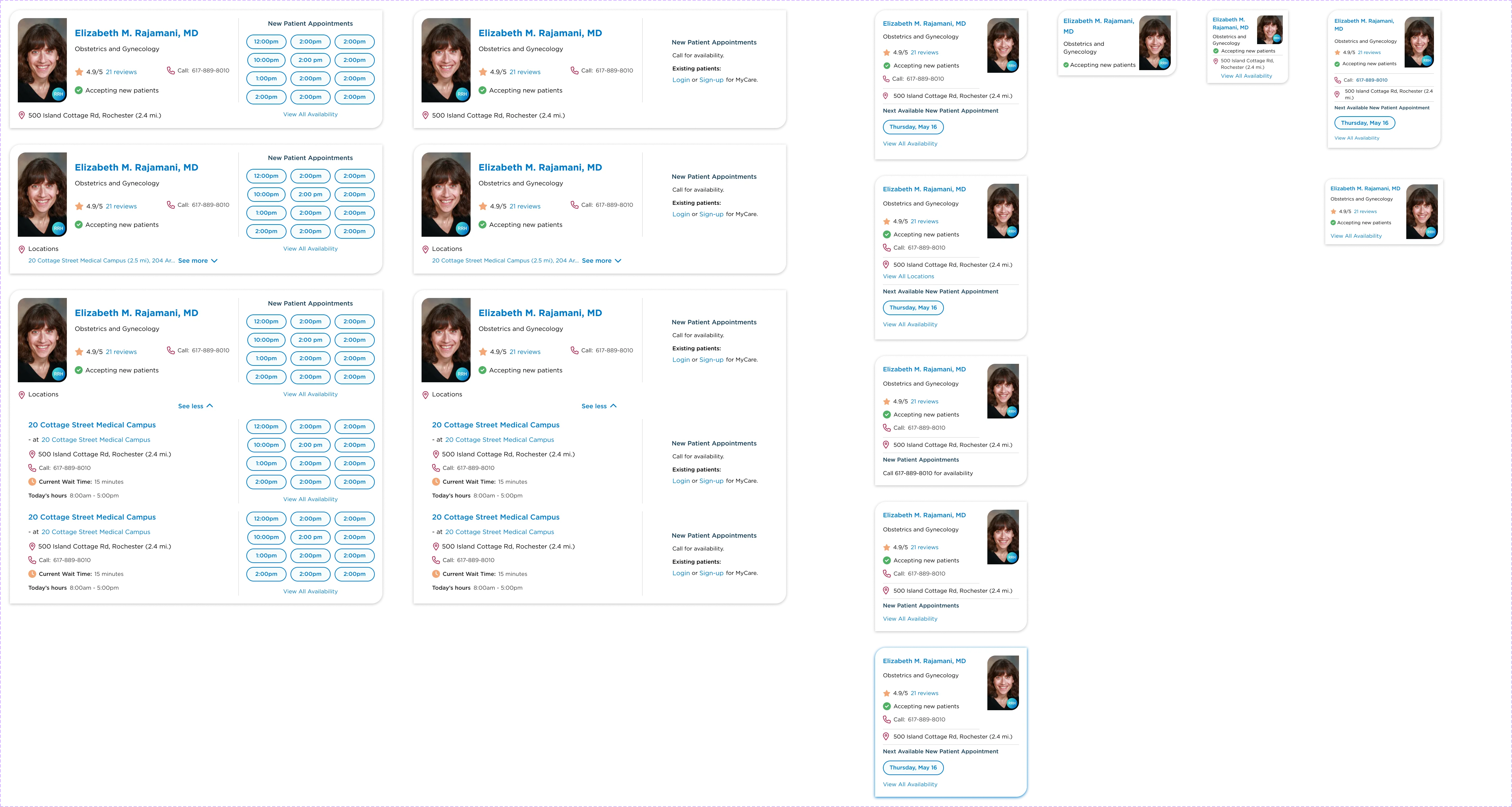
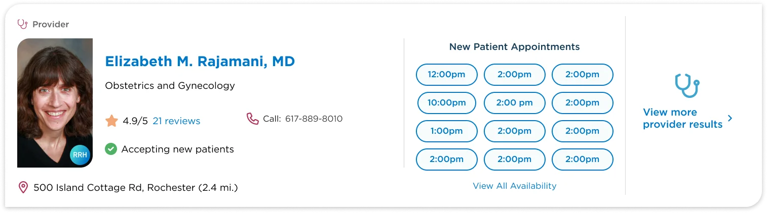
I went through ten major iterations. Early versions included too much — every credential, every location, every specialty. Comprehensive and unusable. Drawing on prior directory work for a large health system and two health plans — projects where I'd seen firsthand which data points carry a provider-selection decision — I pressure-tested the card against a short list. In every one of those projects, four data points show up reliably as the ones that carry a decision: photo, specialty, distance, and next available appointment. Everything else was noise at the scan level, so it moved to the detail view. That principle reframed the entire card design from "show everything we have" to "show only what drives a decision."
The final card hierarchy — provider's face as the anchor, key decision factors scannable in under two seconds, a CTA that doesn't compete with the information — came from applying that pattern and iterating against it in design critiques with the RRH team.

The Search Results System
With the card locked, I designed outward: the results list, the filter system, the map view, and the interplay between them.
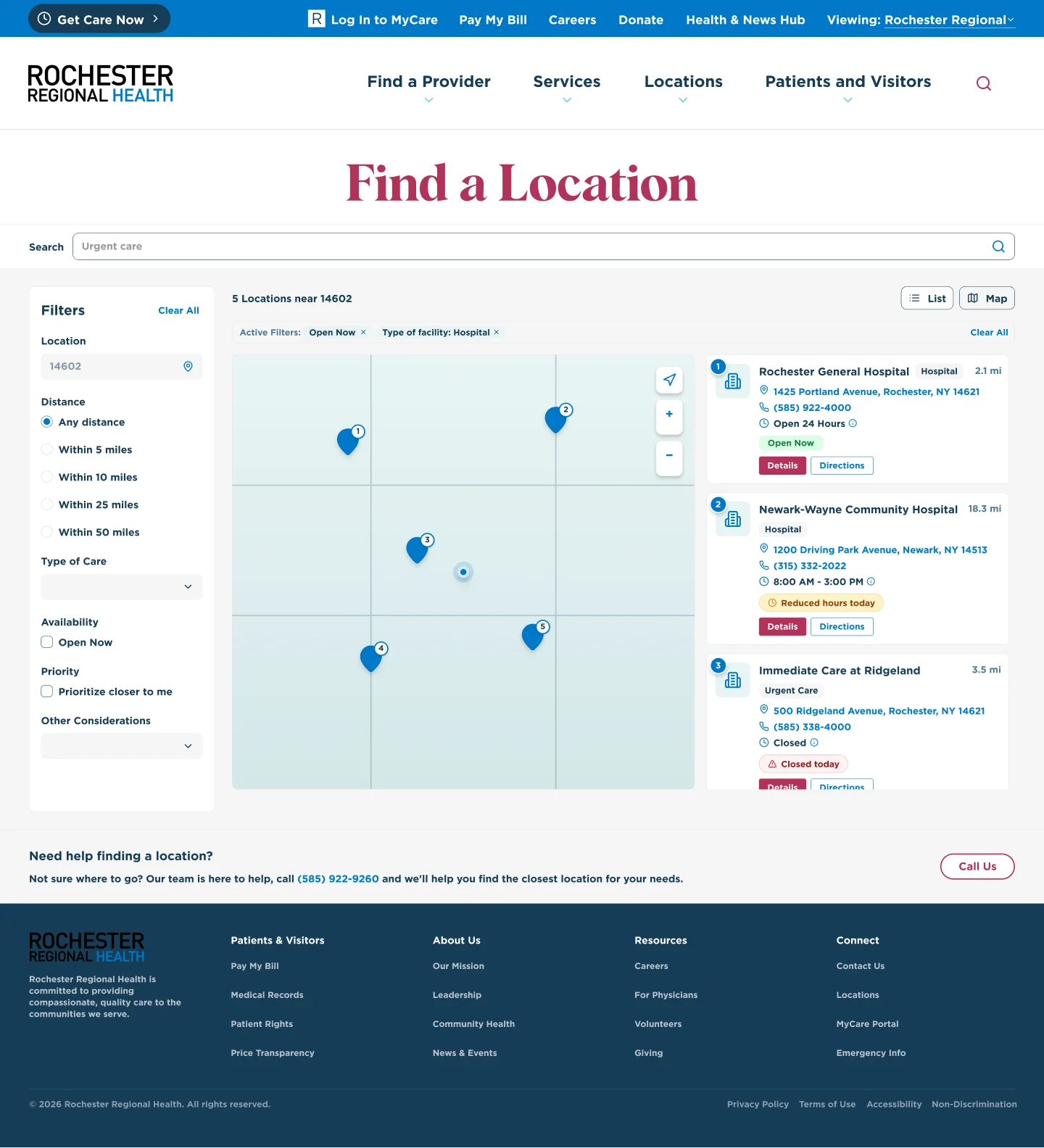
List vs. Map: I designed both a list view and a map view for provider search, with a seamless toggle between them. The list optimizes for comparison (scanning multiple providers quickly), while the map optimizes for proximity (understanding where providers are relative to you). On mobile, the map view includes a bottom sheet with provider cards that users can swipe through—tapping a map pin highlights the corresponding card, and vice versa.
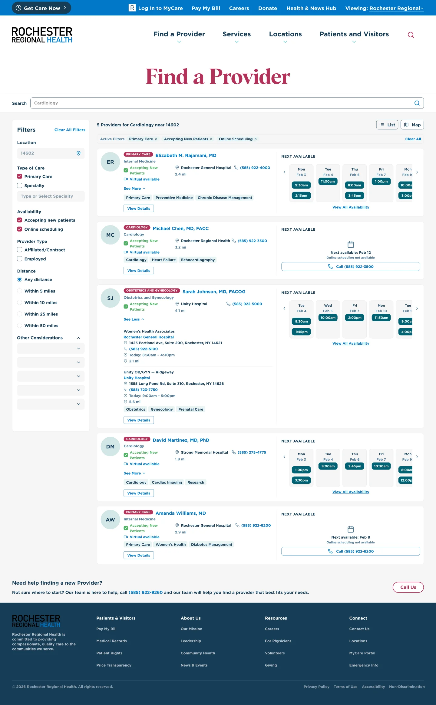
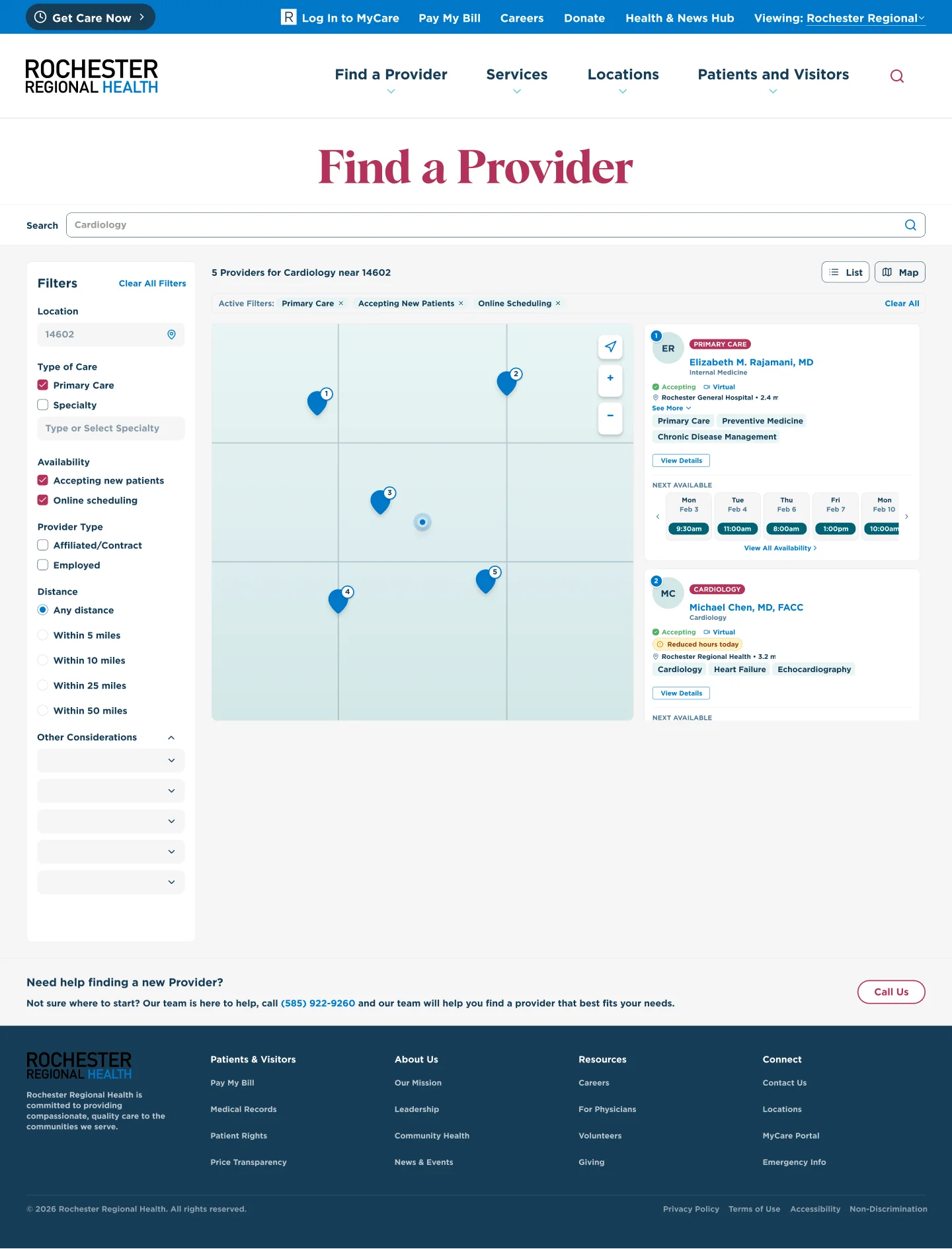

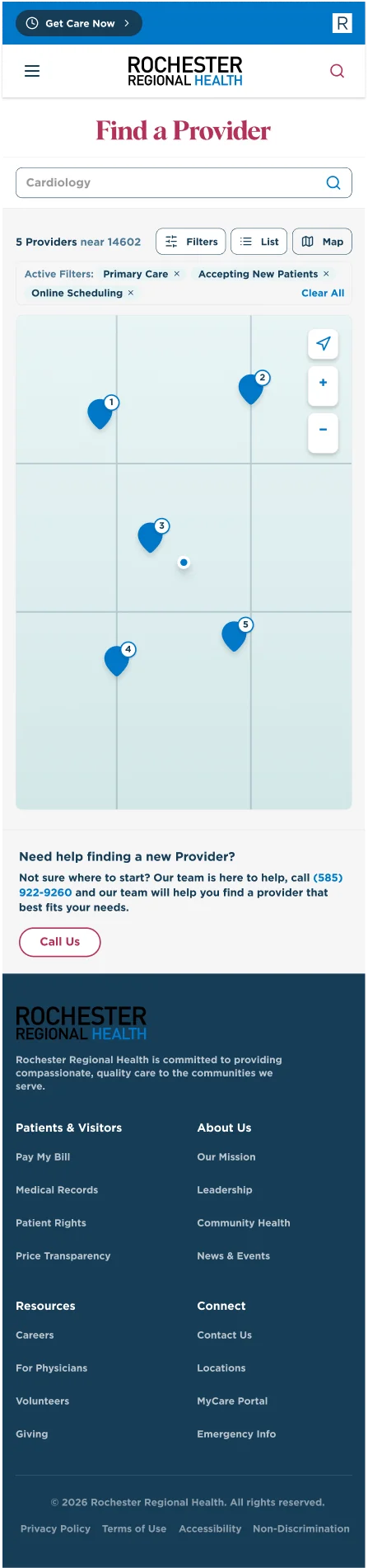
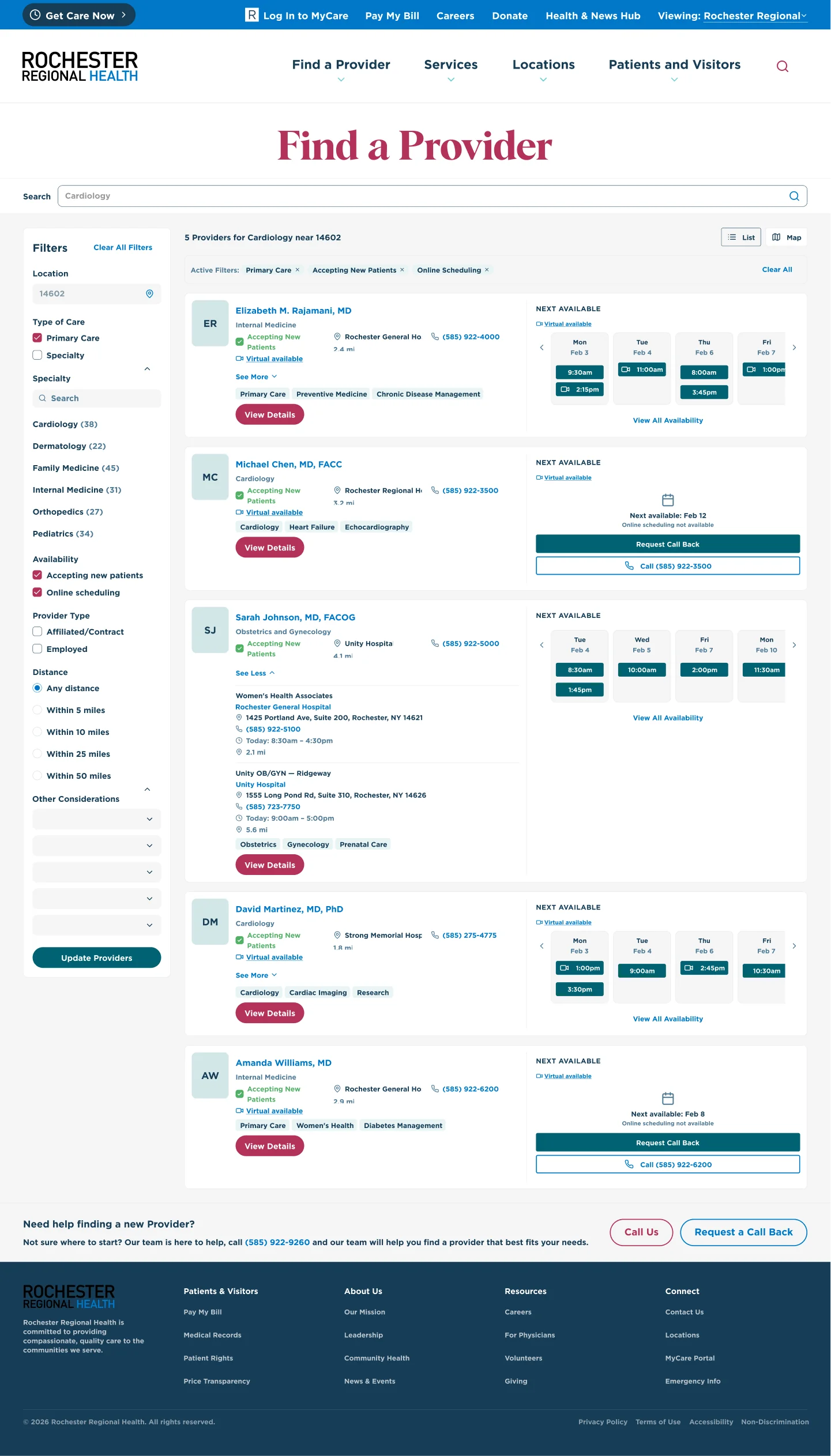
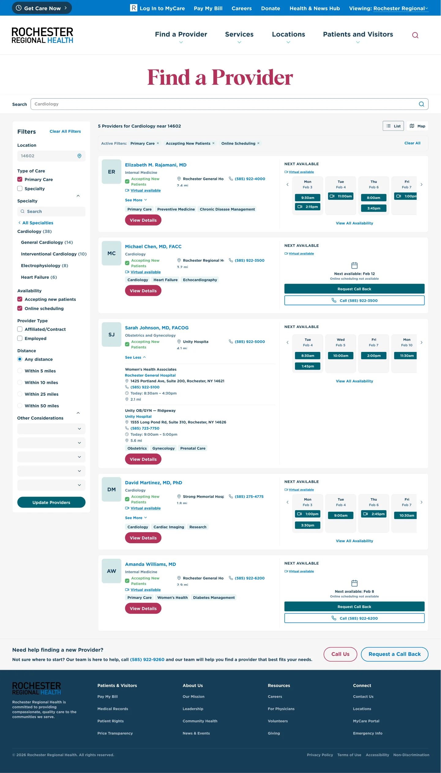
The Filter System: Healthcare search filters are uniquely complex. Patients need to filter by specialty, insurance accepted, gender, language, distance, and availability—but presenting all of these at once overwhelms. I designed a layered approach to filtering: quick-access filter pills for the most common criteria, with a full filter panel for more specific searches. On mobile, filters expand to a full-screen sheet, giving each option enough space to be easily tapped.
Category Browsing: Not everyone arrives at search with a query. I designed a category-based browsing path—top-level categories (Primary Care, Specialists, Mental Health) that narrow into subcategories, giving patients a guided alternative to free-text search.
Extending the Pattern
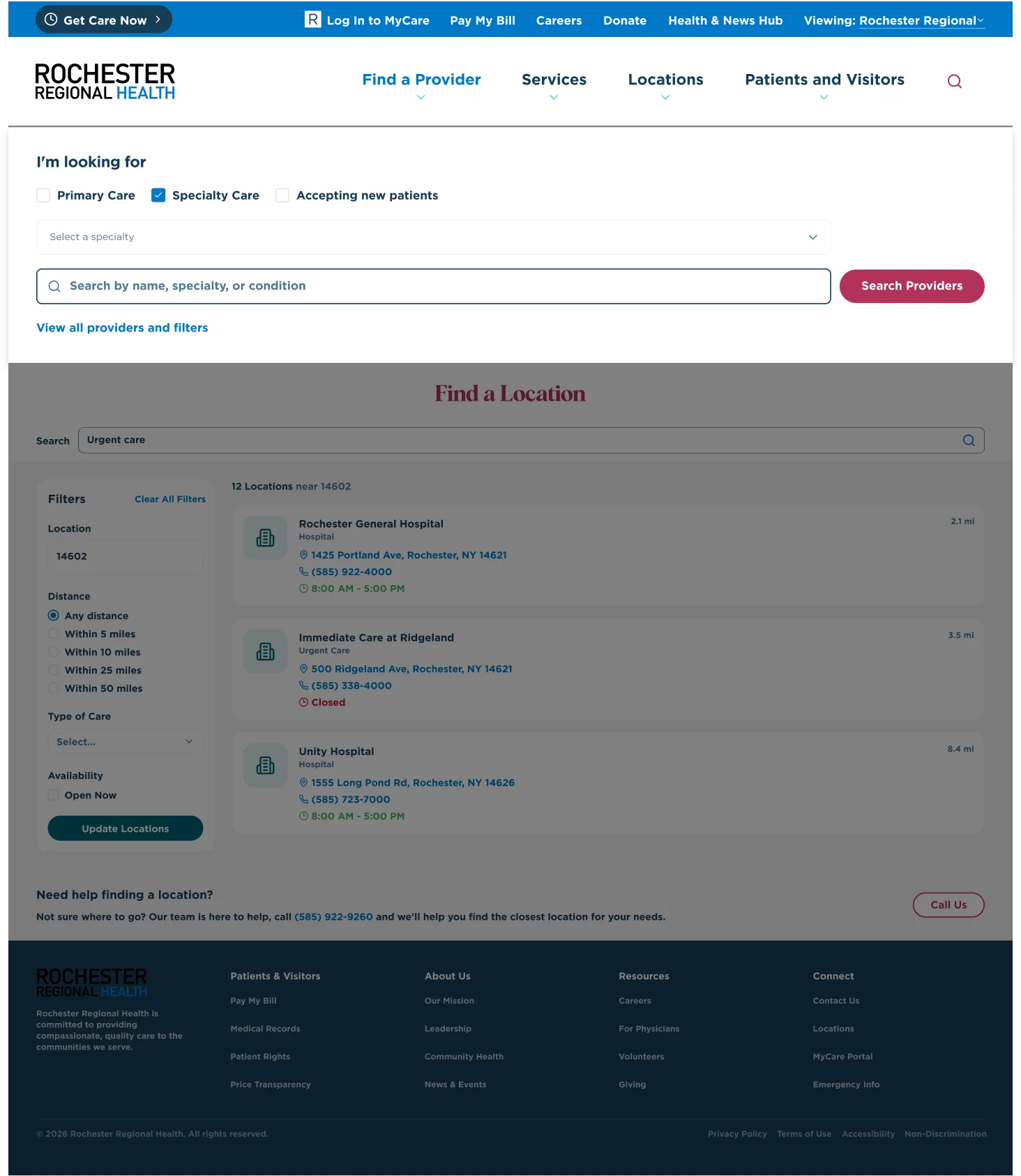
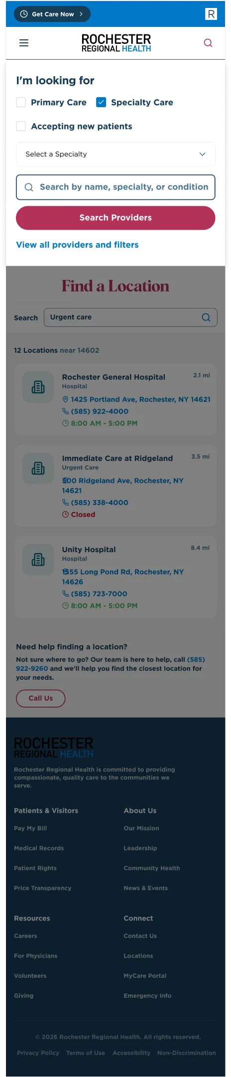
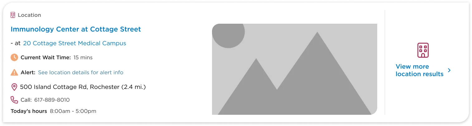
The provider card pattern became the foundation for two additional search surfaces: Location Search (facilities, urgent care centers, imaging centers) and Site Search (a unified search integrating providers, locations, and web content). These were at varying stages of design maturity—the location cards were more developed, while site search cards were still in early exploration—but the shared card framework ensured visual consistency as each surface evolved.

What I Shipped
- A complete provider search experience with list view, map view, filtering, and category browsing—fully responsive across desktop and mobile
- A location search experience with the same dual-view pattern
- A unified site search that integrates providers, locations, and content
- A result card design system (provider cards, location cards, content cards) that creates consistency across all search surfaces
- Desktop and mobile designs for every state: loading, empty results, error, single result, map interactions, filter states
What I Learned
The RRH work reinforced the power of designing the smallest unit first. By investing weeks in the provider card before touching page layouts, every downstream decision had a solid foundation. When stakeholders wanted to add information to the results page, the conversation always came back to: "Does this belong on the card, or the detail view?" That single constraint — grounded in prior directory pattern recognition, not stakeholder preference — kept the system clean through dozens of design reviews.
RRH also reinforced the dual nature of search: some users arrive with a query, others need to browse. The system works because it serves both mental models without forcing either one — and the pattern from prior directory work made that case clearly enough that the team invested in building both paths rather than cutting one for scope.