Rebuilding a 90-Year-Old Organization's Digital Presence
The Problem Worth Solving
The Knights of Columbus is one of the world's largest Catholic fraternal organizations—nearly 2 million members, a Fortune 1000 insurance business, and a charitable arm that distributes hundreds of millions of dollars annually. Their website needed to serve all of it: membership recruitment, insurance product discovery, charitable giving, council management, and content spanning faith, community, and financial planning.
The existing site had grown organically over years, accumulating pages and sections without a coherent structure. Members couldn't find what they needed. Prospective members couldn't understand what the organization offered. Insurance customers had no clear path from "I'm interested" to "here's the right product for me." Our job: tear it down to the studs and rebuild from scratch.
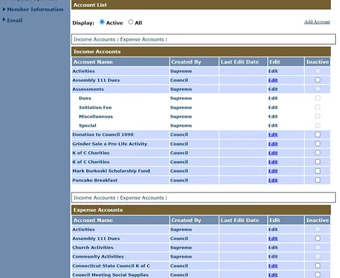
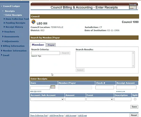
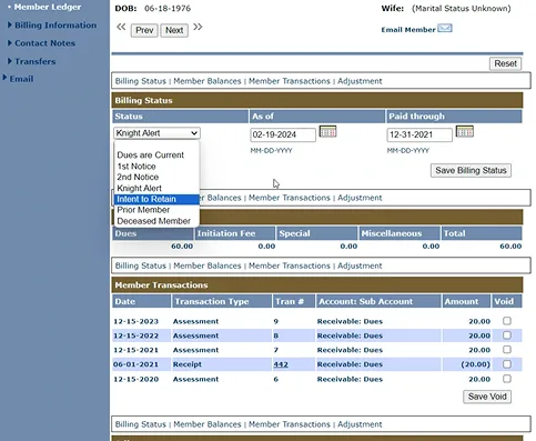
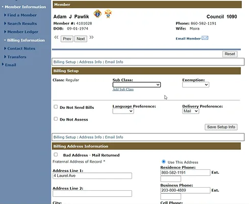
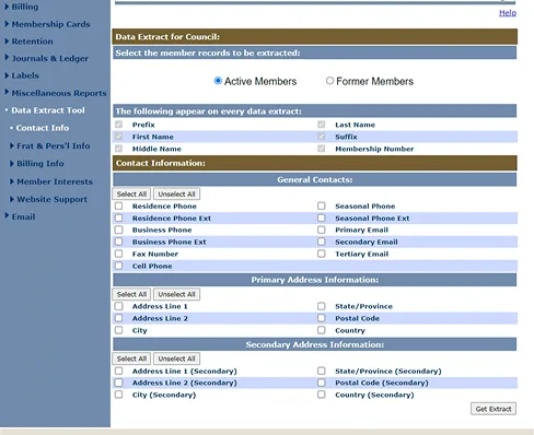
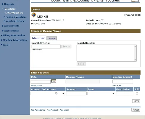
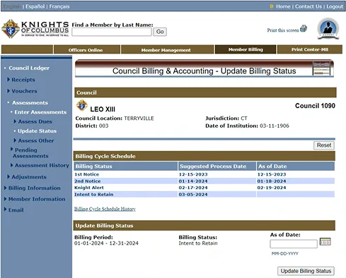
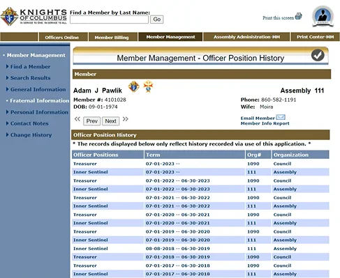
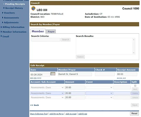
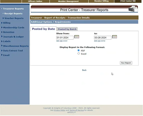
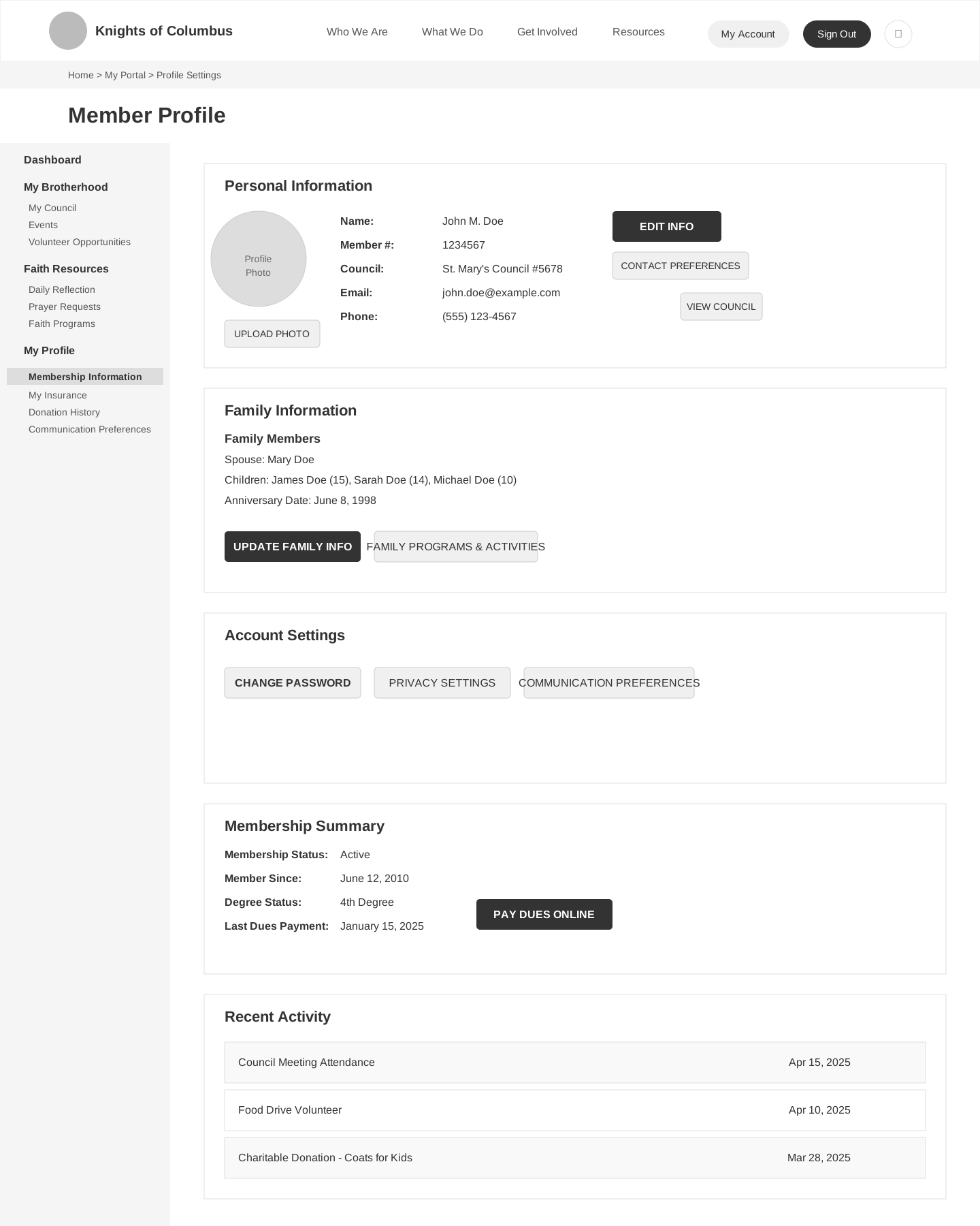
To understand the scope of the transformation, look at what council officers were working with. The existing officer portal was a utilitarian system built for data entry, not for people trying to manage a council:
What Made This Hard
The Knights of Columbus isn't a startup with a single product. It's a complex organization with overlapping audiences and competing priorities: prospective members, existing members, insurance customers, council leaders, and the general public. Five audiences. One site. And the organization had strong opinions—developed over nine decades—about how their story should be told.
How I Approached It
Information Architecture: The Foundation
I started with the IA, because everything else depends on it. I led open and closed card sorting exercises and stakeholder workshops with 29 participants across two-day sessions — representatives from insurance, membership, charitable programs, and communications. The workshops surfaced a fundamental mismatch: the organization structured content by internal department, but every stakeholder group articulated their audience in task-and-need terms. Insurance wasn't "Financial Services" to a prospective member — it was "protect my family." That alignment across stakeholder groups gave us the evidence to push back on the org chart as a navigation model.
The resulting IA separated the site into audience-oriented sections while maintaining a unified navigation that didn't force users to self-identify before browsing. Insurance products got their own section with a clear taxonomy. Membership had a distinct path from discovery to sign-up. Charitable giving was elevated to a top-level section rather than buried under "About Us" — a decision that stakeholders initially resisted until the workshop task taxonomy showed that donors expected giving to be a primary path, not a sub-page.
User Flows: Tracing the Critical Paths
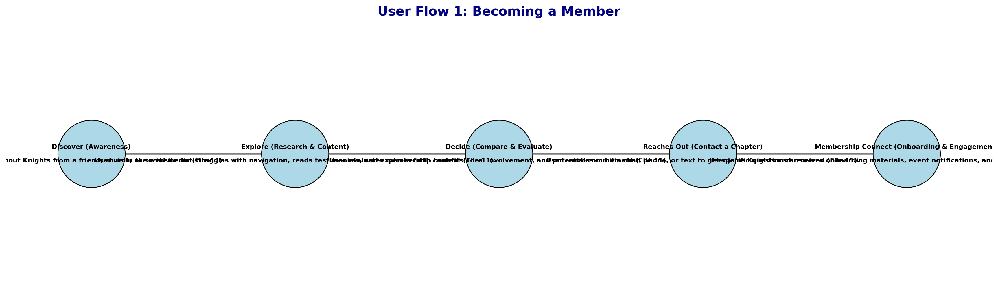
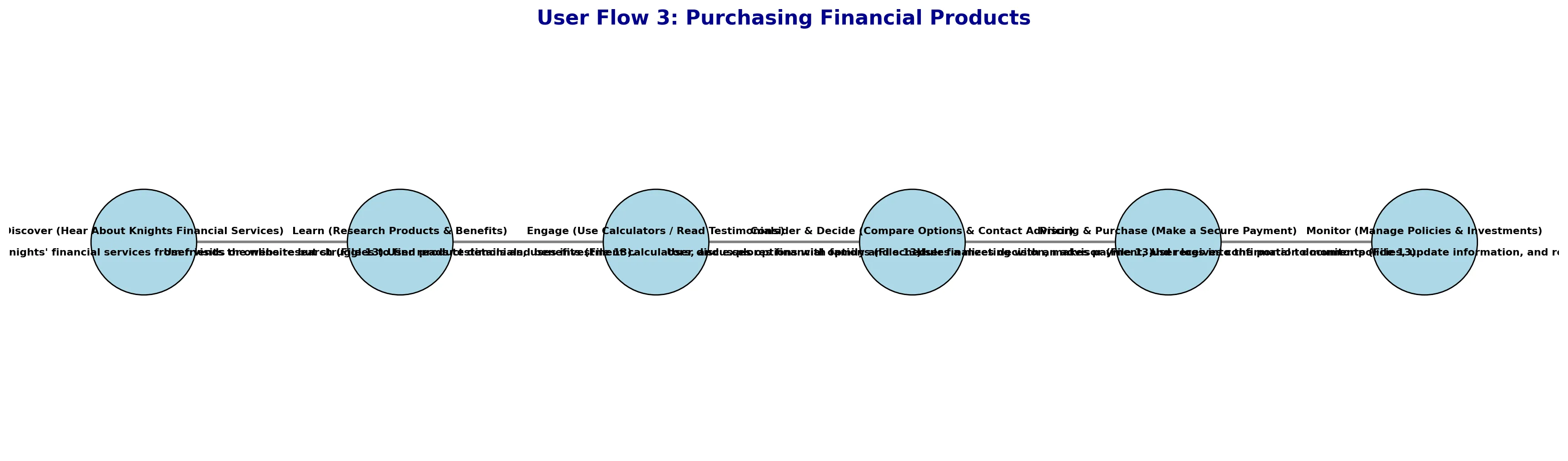
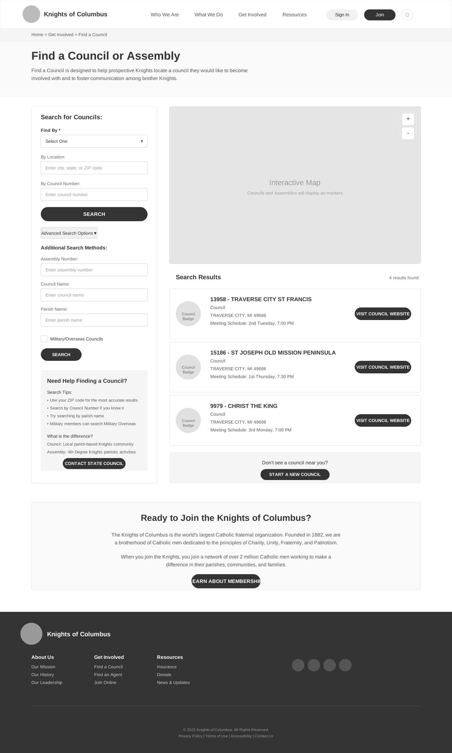
With the IA established, I mapped the user flows for the highest-priority journeys: Becoming a member (from discovery to council sign-up), purchasing a financial product (from "I need life insurance" to connecting with an agent), and finding and engaging with a council (council finder with map/list views, event discovery, local impact).
From Wireframes to High Fidelity
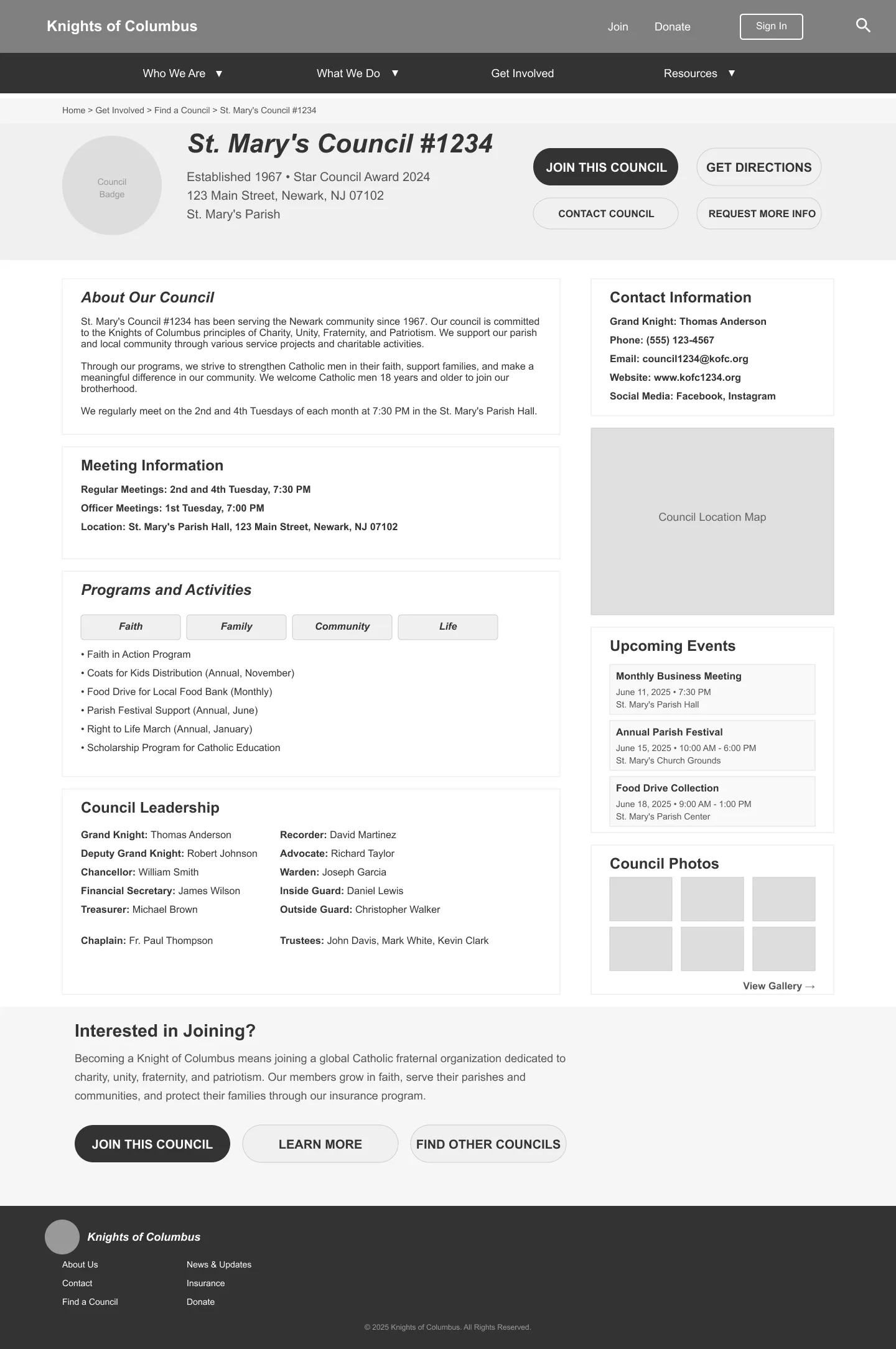
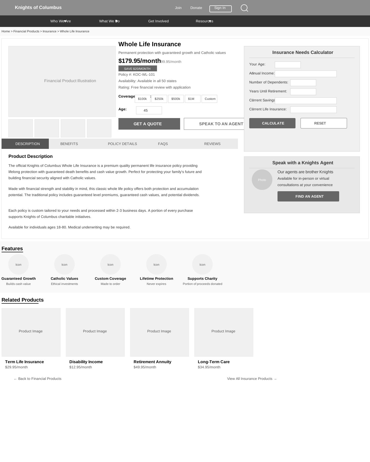
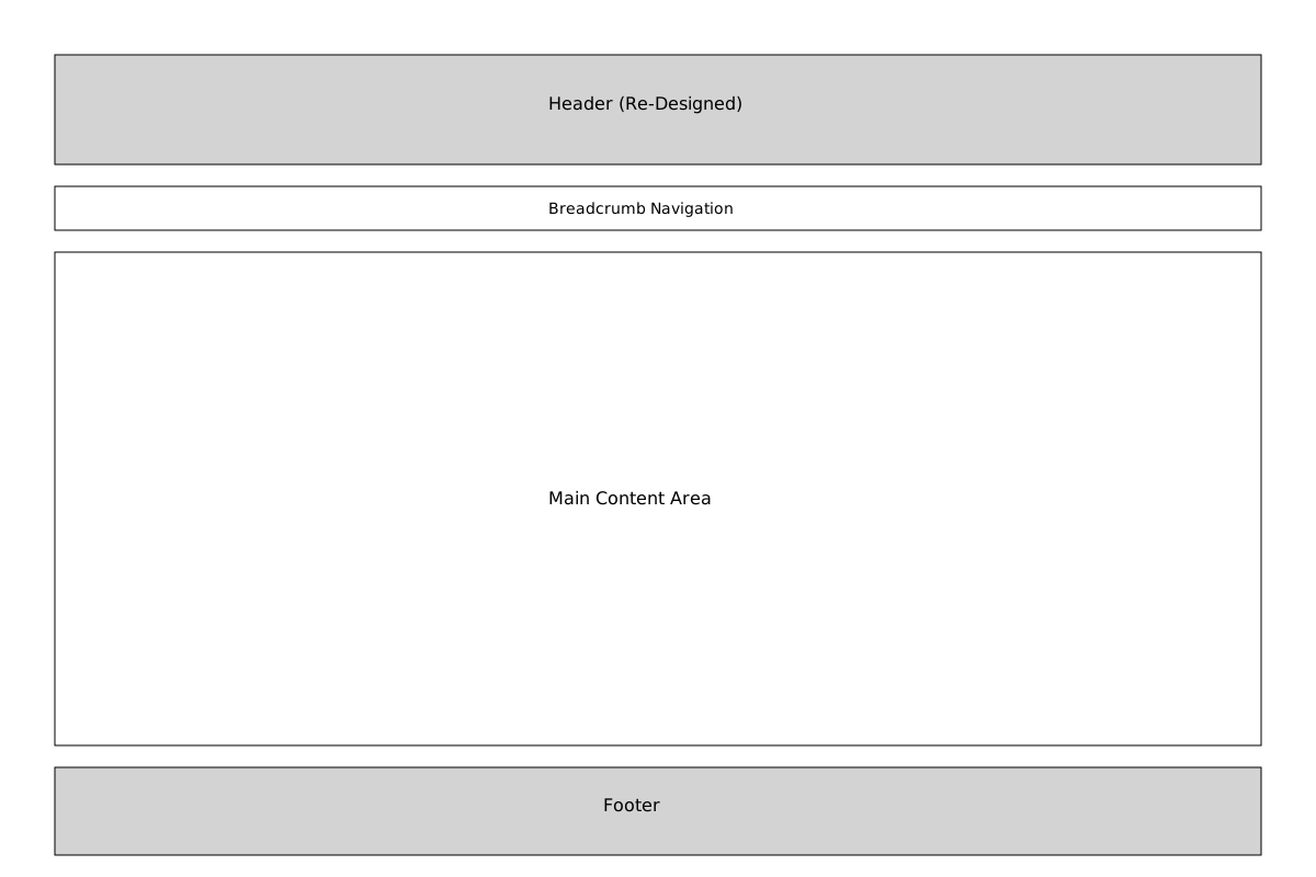
I designed 15+ wireframe templates first — homepage, category landing pages, content templates, insurance products, the membership flow, council finder, and the donation experience. Every wireframe went through stakeholder review before visual design began. This sequencing was deliberate: wireframes let us debate structure and content strategy without getting distracted by color and typography. It saved weeks of rework, because by the time the Knights' blue-and-gold visual identity was applied, the structural decisions were already settled.
The Donation Experience
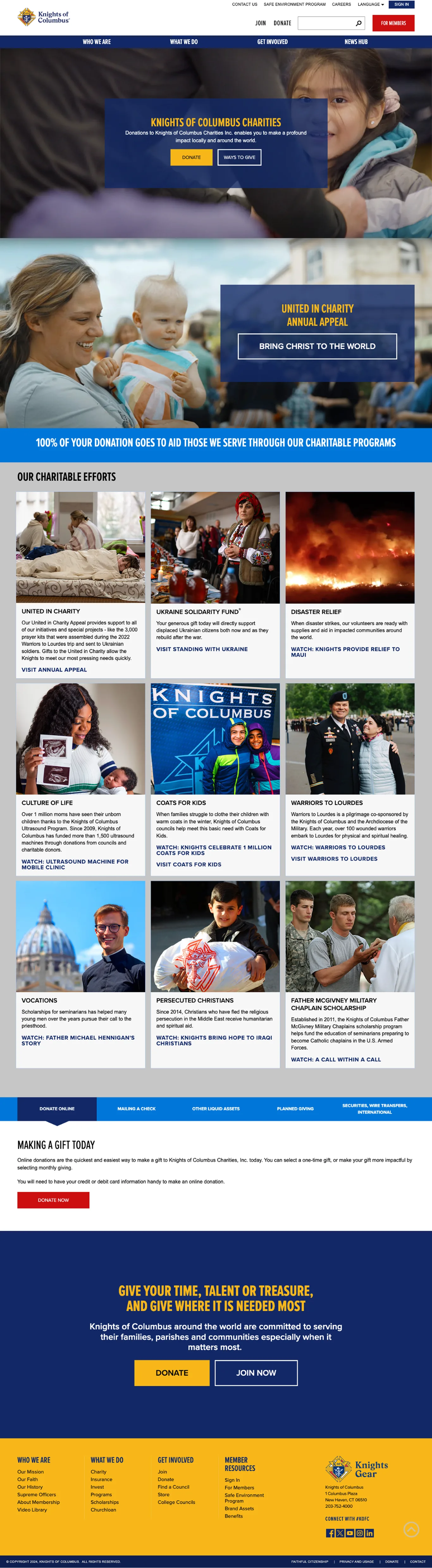
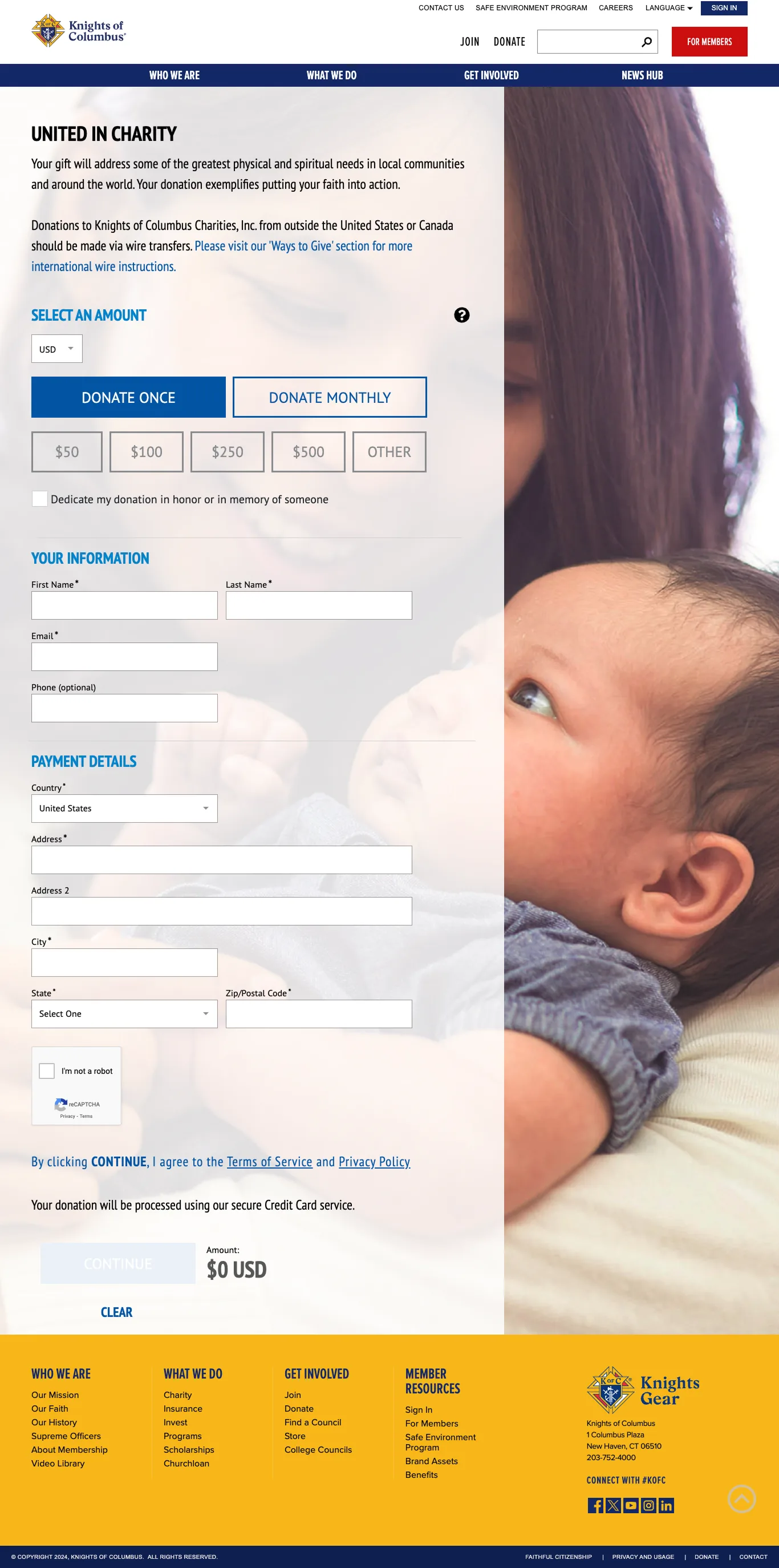
Charitable giving is central to the Knights' mission, but the old site buried donation behind several clicks and offered minimal context about where money went. I redesigned the full donation flow: a landing page that connects donors emotionally to the Knights' charitable programs, a streamlined form with one-time and monthly options, and a previous-donations section for returning donors.

Insurance: From Brochure to Product Platform
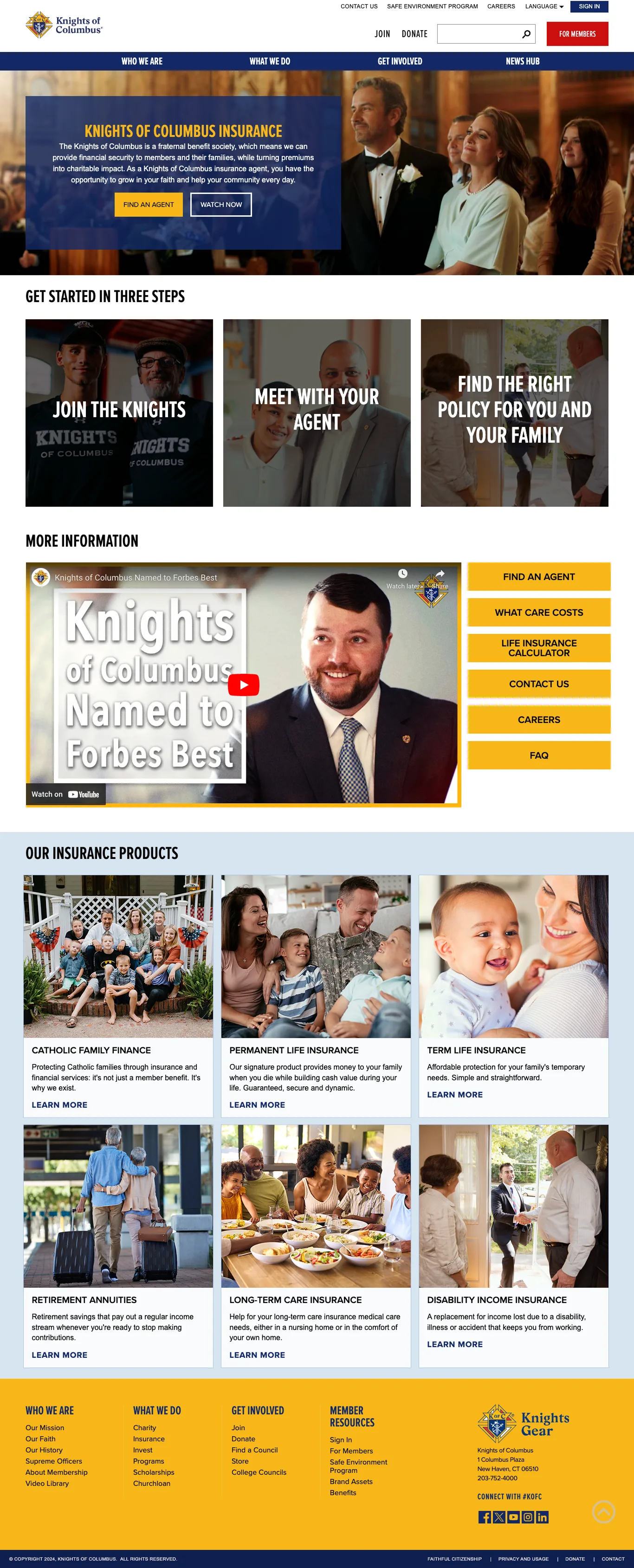
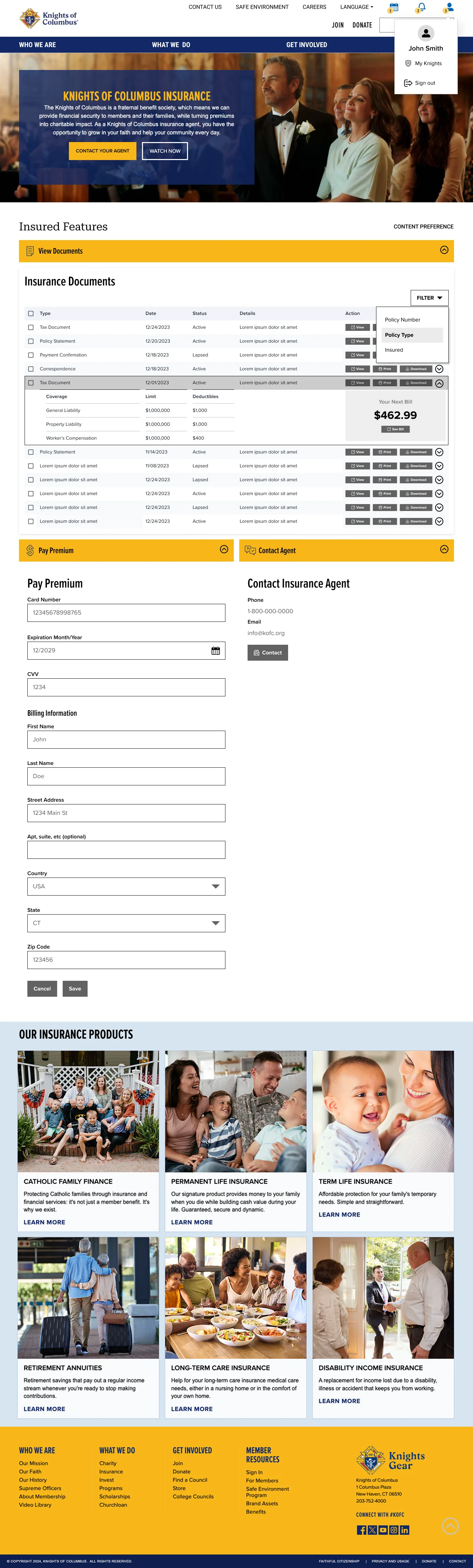
The Knights' insurance business is a Fortune 1000 operation, but the old site treated it like a brochure—flat content pages with no real product taxonomy or user journey. I designed two distinct but connected insurance experiences: a public-facing product discovery flow for prospective customers, and an authenticated portal for existing policyholders to manage documents, make payments, and connect with their agent.
Content Models and Design Patterns
Beyond individual pages, I developed content models that defined the reusable patterns across the site: how a category landing page works, how a product detail page works, how a basic content page works. These gave the Knights' content team a sustainable system for creating new pages that automatically maintain design consistency.
How I Validated It
I ran moderated usability testing with 7 participants — a mix of general users, field management, and internal stakeholders — across the redesigned site. The results validated the approach: the site scored a 4.7 out of 5 average usability rating. The homepage and Resources section both scored a perfect 5/5. Navigation scored 4.5/5. Participants rated the site 5/5 for "intuitive and easy to use," 5/5 for "trustworthy and aligns with KofC brand," and 5/5 for "confident using the site." The insurance product pages — the area I was most concerned about — scored 4.5/5, confirming that the product taxonomy and progressive disclosure approach worked.
What I Shipped
- Complete information architecture and navigation system for kofc.org
- User flows for three primary journeys (membership, insurance, council engagement)
- Full wireframe system: 15+ page templates covering all content types
- High-fidelity designs for key pages: homepage, insurance products, donation flow, council finder, membership information
- 20+ content models and design pattern documentation
- Stakeholder presentations covering IA rationale, user testing findings, and design evolution
What I Learned
The Knights of Columbus project was a masterclass in designing for organizational complexity. The hardest part wasn't any individual screen—it was making coherent decisions about information architecture when the organization itself is multifaceted and every stakeholder group has legitimate reasons to want their content prioritized.
The project reinforced that good IA isn't about organization—it's about prioritization. Everything can't be equally important. The IA had to make bold choices about what's primary, secondary, and tertiary, and then defend those choices with stakeholder-workshop evidence rather than internal politics.
This project also reinforced the value of the wireframe-to-high-fidelity progression as a stakeholder management tool. By getting structural alignment in wireframes before introducing visual design, we avoided the trap of stakeholders debating button colors when the real issue was content hierarchy. It's a pattern I'd used before, but the Knights' project—with its many stakeholder voices—proved just how essential that sequencing is.