Designing a Cross-Platform Native App for Building Lifecycle Management
The Problem Worth Solving
Building Information Modeling (BIM) is how the construction industry ensures that what gets built matches what was designed. BA Connect was a quality assurance platform built by Invicara (now Twinit) that allowed professionals to run analysis rules against BIM models, track issues, manage defects, and collaborate across teams—from construction through the entire building lifecycle. Think of it as a quality control dashboard that follows a building from groundbreaking to daily operations, designed to be used on an iPad propped up on a steel beam or a phone pulled from a hard hat.
The product needed to ship on both iOS and Android, supporting phones and tablets, with a shared functionality set but platform-native interaction patterns.
What Made This Hard
Cross-platform native design requires holding two mental models simultaneously. iOS and Android have different navigation paradigms, interaction patterns, and user expectations. A good cross-platform app feels native on each platform while maintaining a consistent brand and feature set — not one that looks identical everywhere.
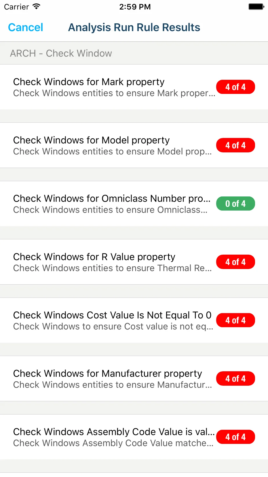
The domain added complexity. BIM and construction QA is deeply technical, and the app had to surface analysis rule results, defect categories, and issue tracking workflows in a way that construction professionals could use on-site. Stakeholders described the realities in granular detail: outdoor glare, gloved hands, constant interruptions. Every interaction had to be fast and forgiving.
How I Designed It
iPad as the Primary Surface
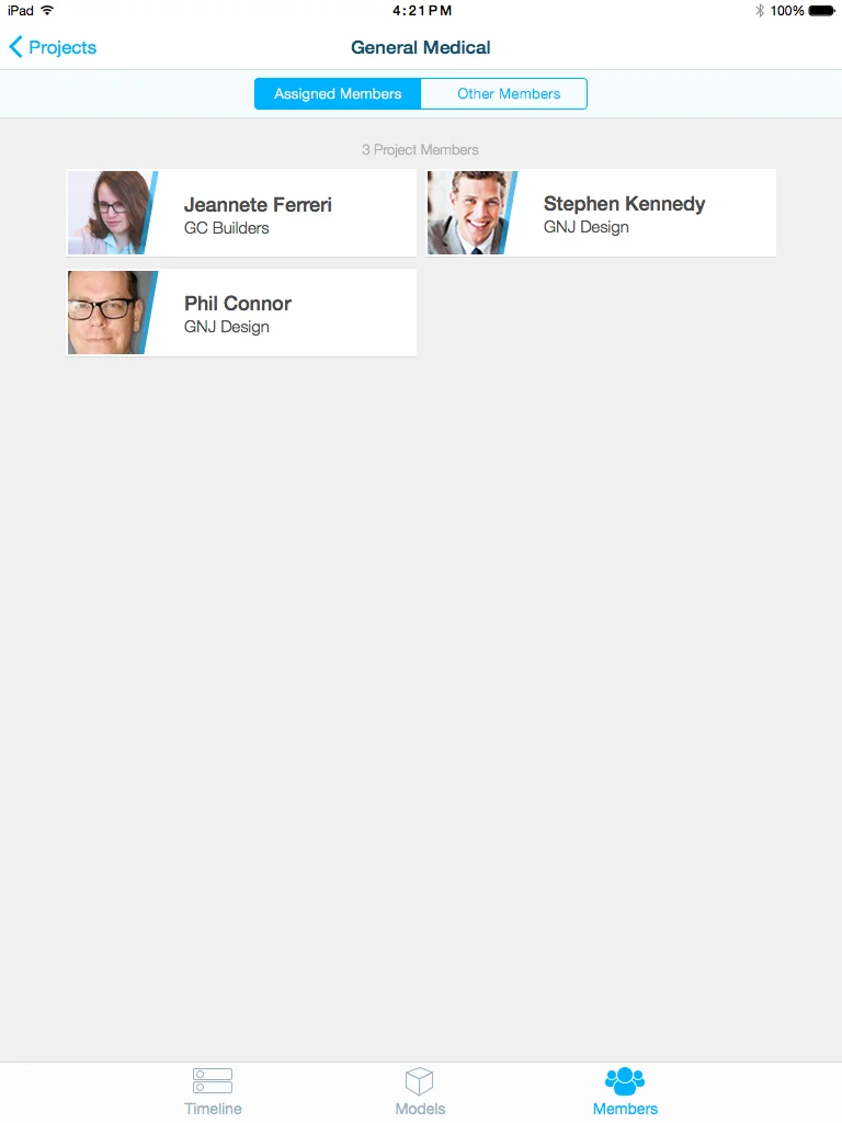
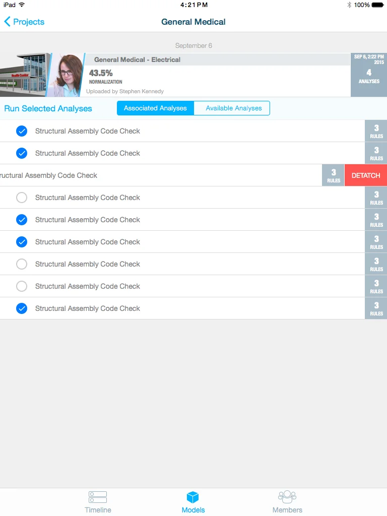
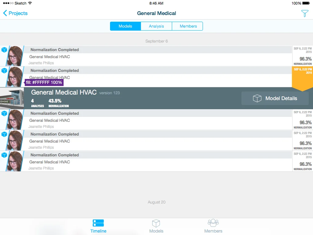
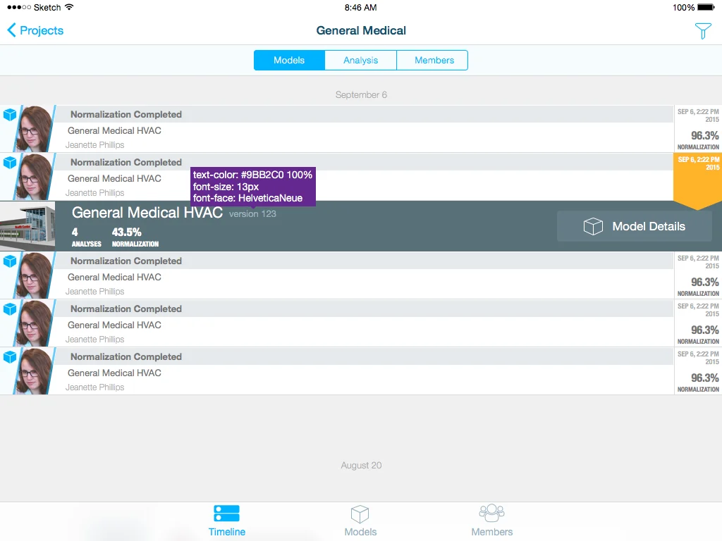
The iPad was the hero device. Stakeholders identified the tablet as the primary on-site device, and the larger screen allowed for the data density that BIM analysis requires. I designed the iPad experience first, establishing the information hierarchy, the dashboard structure, and the core workflows, then adapted down to phone and across to Android.
The iPad dashboard gives users an immediate overview of their projects and analysis runs, with drill-down paths into specific results. I used a split-view pattern—list on the left, detail on the right—which is a natural fit for browsing analysis results and diving into specifics without losing context.
Platform-Appropriate Adaptation
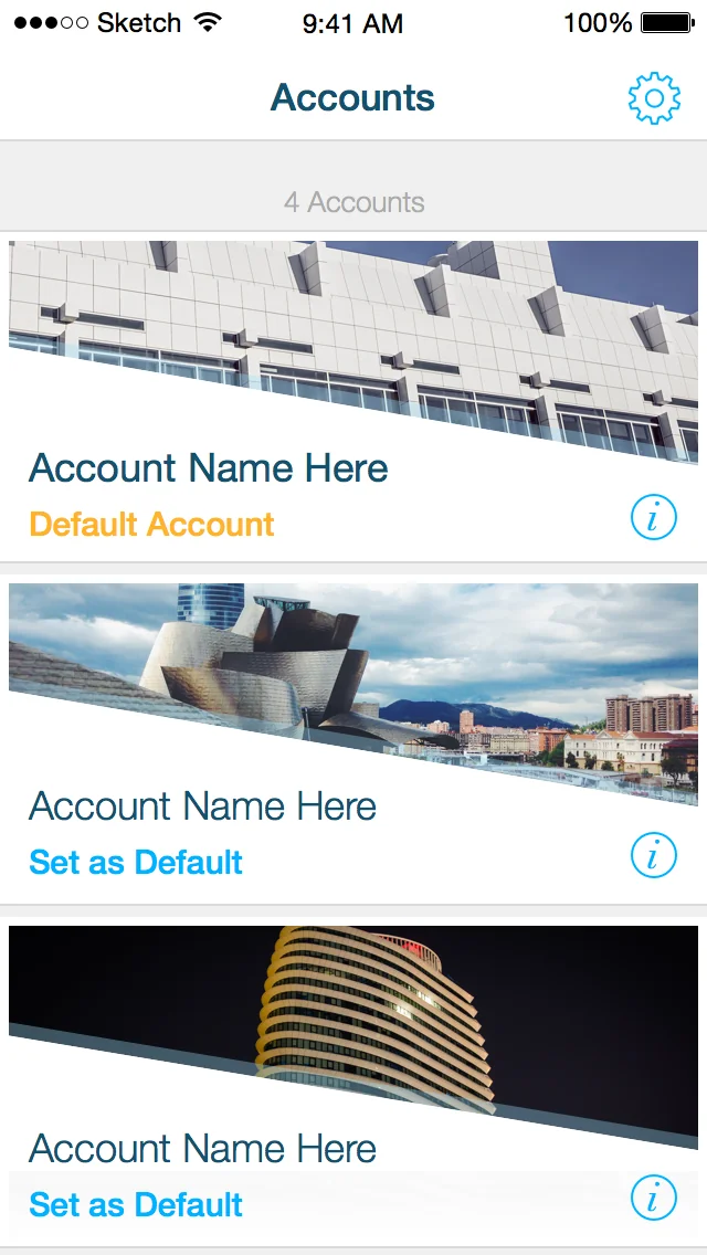
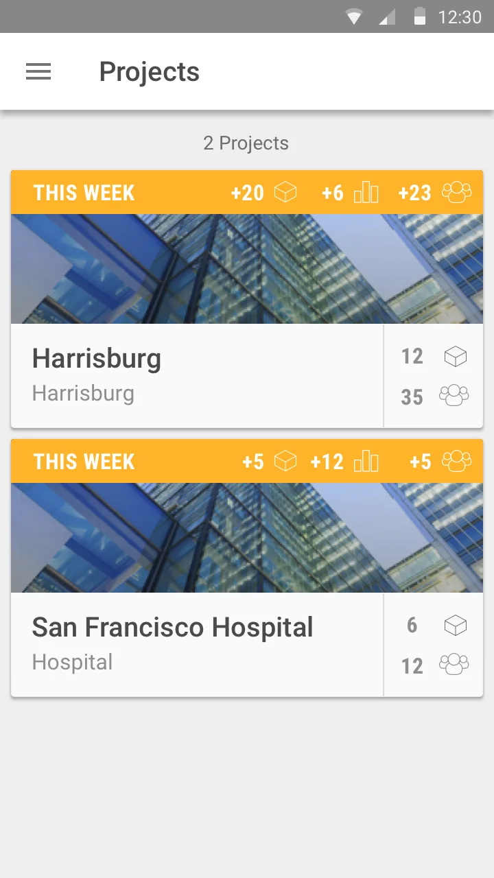
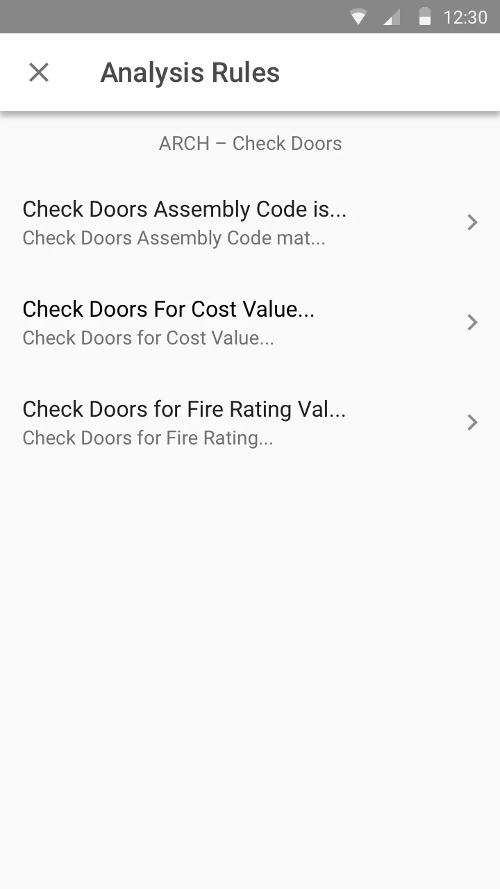
For iOS, navigation lives in a tab bar with clear, glanceable icons. Settings and account management follow iOS conventions. For Android, I adapted the navigation to a drawer pattern, moved key actions to a floating action button where appropriate, and followed Material Design conventions for cards, lists, and form elements. The Android version feels like an Android app—not an iOS port with a different skin.
The Design System
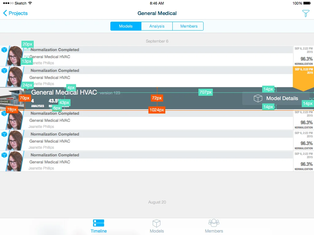
I built a documented style guide that served as the contract between design and development: typography scales for both platforms (SF Pro for iOS, Roboto for Android), a semantic color system, component specifications with iOS and Android variants, spacing and grid systems, and a shared icon set with platform-appropriate styles.
The style guide wasn't an afterthought—it was a living document that I maintained throughout the project. When engineers had questions about how a component should behave on a specific platform, the answer was in the guide.
Key Workflows
Analysis Run Review: Open a project, select an analysis run, review results by rule type and severity, drill into specific model elements, take action.
Defect Management: Create a defect, attach photos from the job site, assign a responsible party, track resolution. This workflow had to be fast — capture the issue, move on, don't linger in the UI.
Project Collaboration: Discussion threads tied to specific analysis results or defects, allowing distributed teams to collaborate asynchronously across locations.
What I Shipped
- Complete native iOS app design (iPhone and iPad) — 97 screens
- Complete native Android app design (phone and tablet) — 39 unique screens plus platform adaptations
- Documented design system / style guide covering both platforms
- Dashboard, analysis review, defect management, and collaboration workflows
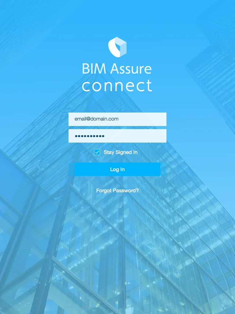
- Login, onboarding, profile management, and settings for both platforms
What I Learned
BA Connect taught me that cross-platform design is translation, not duplication. The goal isn't to make the apps look the same—it's to make them feel equally well-crafted on each platform while delivering the same capabilities.
The project also sharpened my appreciation for designing for harsh contexts. When your users are on construction sites — a context our stakeholders described in granular detail — every design choice gets pressure-tested against conditions that most interfaces never have to survive. Touch targets need to be generous. Contrast needs to be high. Navigation needs to be dead simple. There's no tolerance for cleverness that gets in the way of utility.
This was a formative project for my approach to design systems. The style guide I built for BA Connect was one of my earliest experiences creating a design system that developers actually used as a daily reference. Every design system I've worked on since has been informed by what I learned here about the gap between a design and a specification.