Designing for Health Plan Members Across Multiple Systems
The Through Line
Over the course of my career at Perficient, I've designed member-facing health plan portals for multiple clients: a regional health plan, a Perficient-branded health plan platform, and Appian-powered healthcare portals. Each project had its own client, constraints, and timeline. But each one was fundamentally the same design problem: how do you make health insurance understandable?
Health plan portals serve people at their most confused and often most anxious — trying to understand benefits, find forms, or navigate a process they didn't choose. The content was written by lawyers and actuaries, not by people trying to be understood. I've now designed this product type three times, and each iteration sharpened my understanding of what works and what fails.
The Regional Health Plan: The Deep Dive
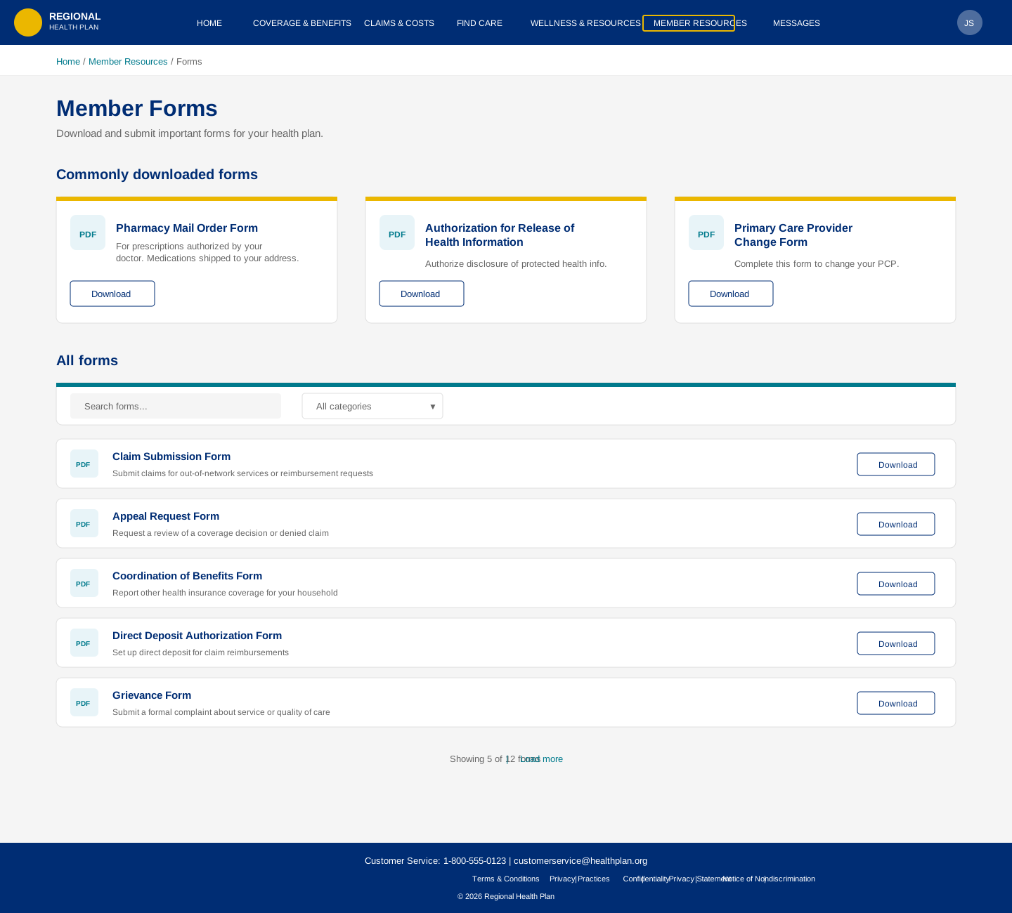
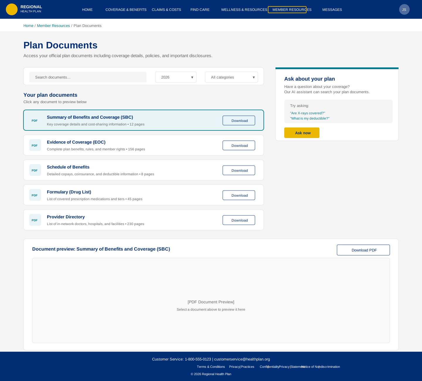
The health plan portal was the most comprehensive engagement. I designed 19+ responsive page templates covering the full breadth of a health plan member portal:
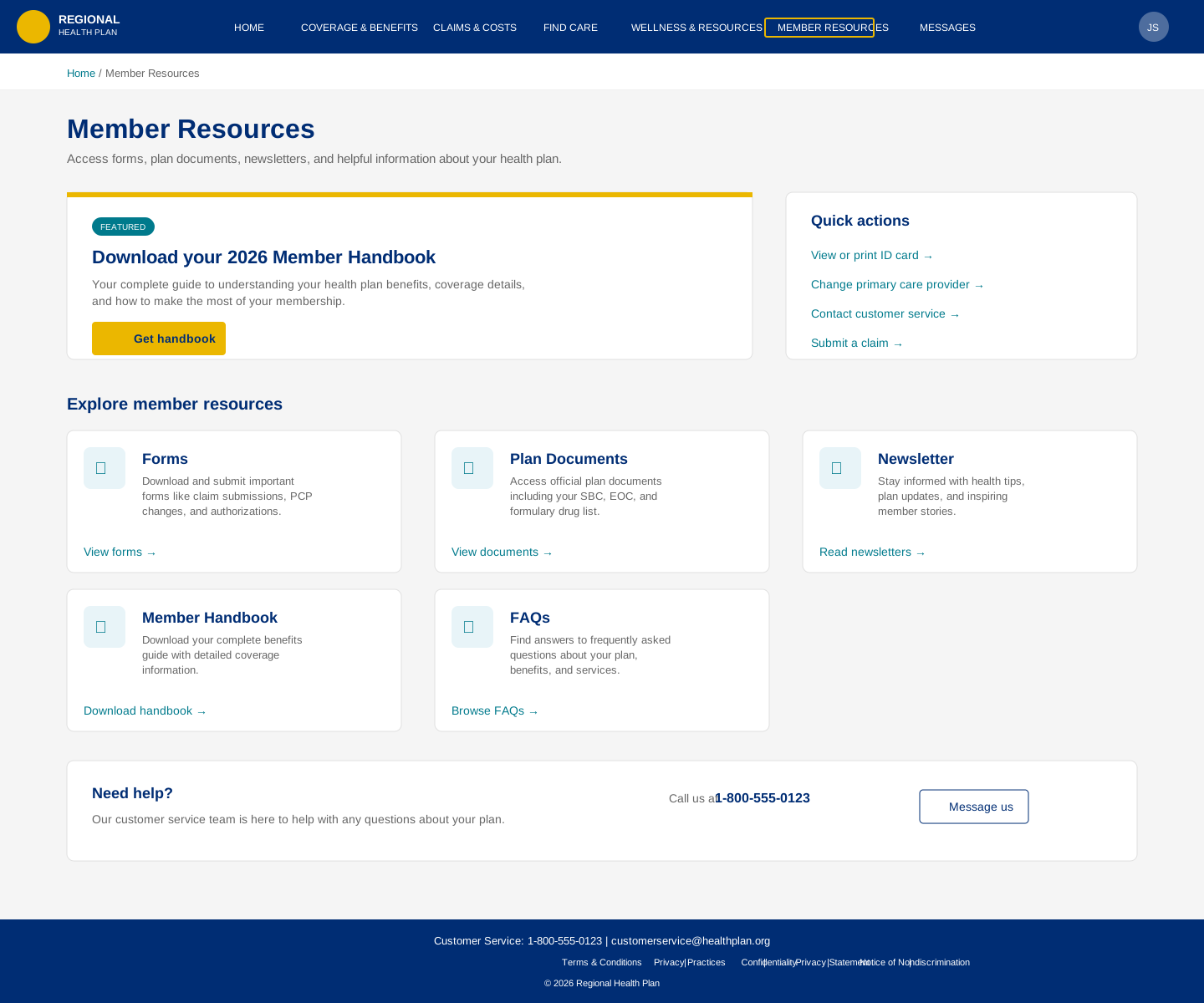
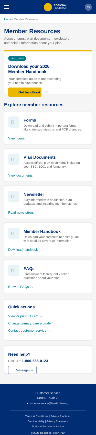
Member Resources: The landing page for everything a member needs—forms, handbooks, newsletters, plan documents, FAQs. I designed a card-based resource landing that groups content by task type rather than document type, with clear visual hierarchy that lets scanners find what they need and browsers discover what's available.
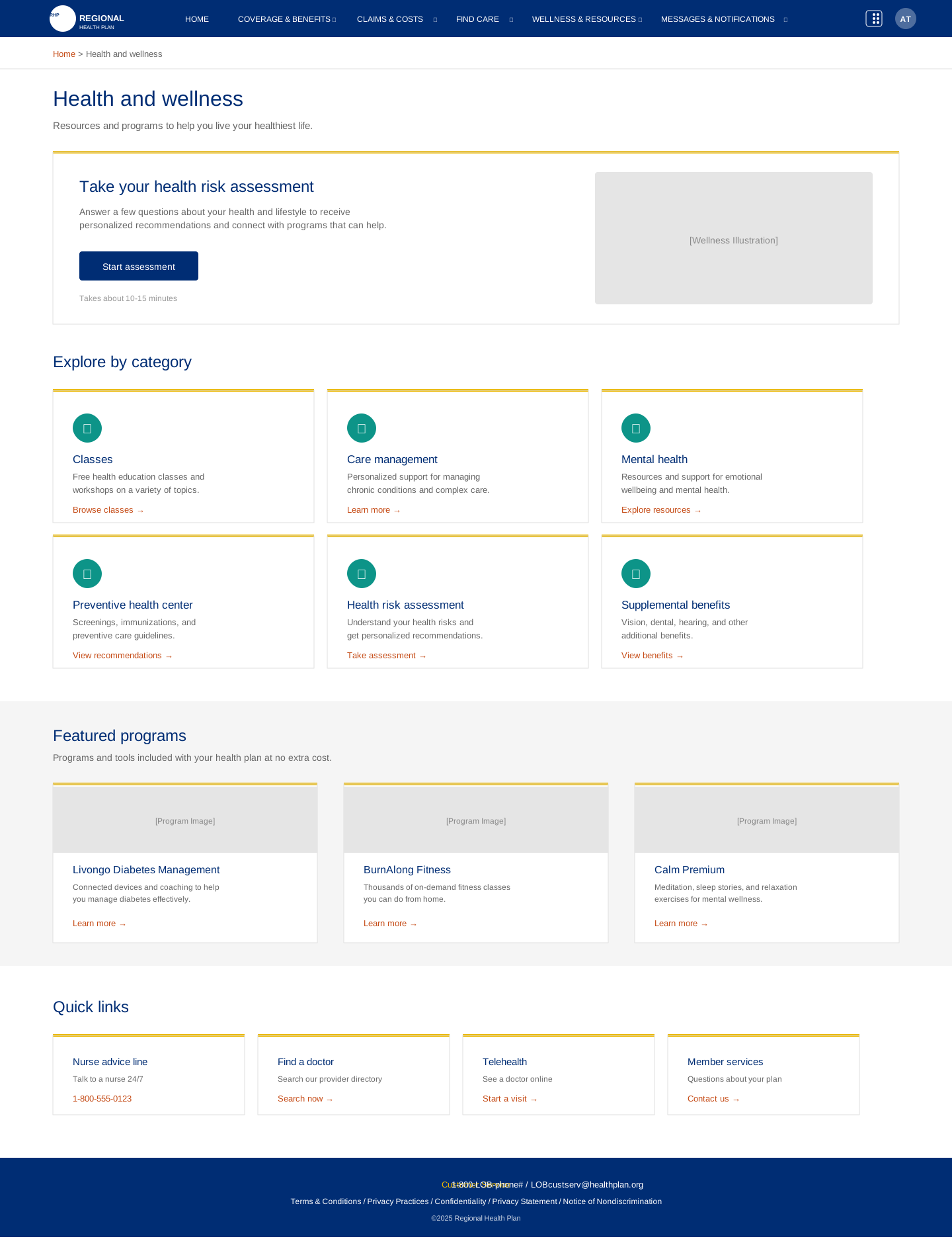
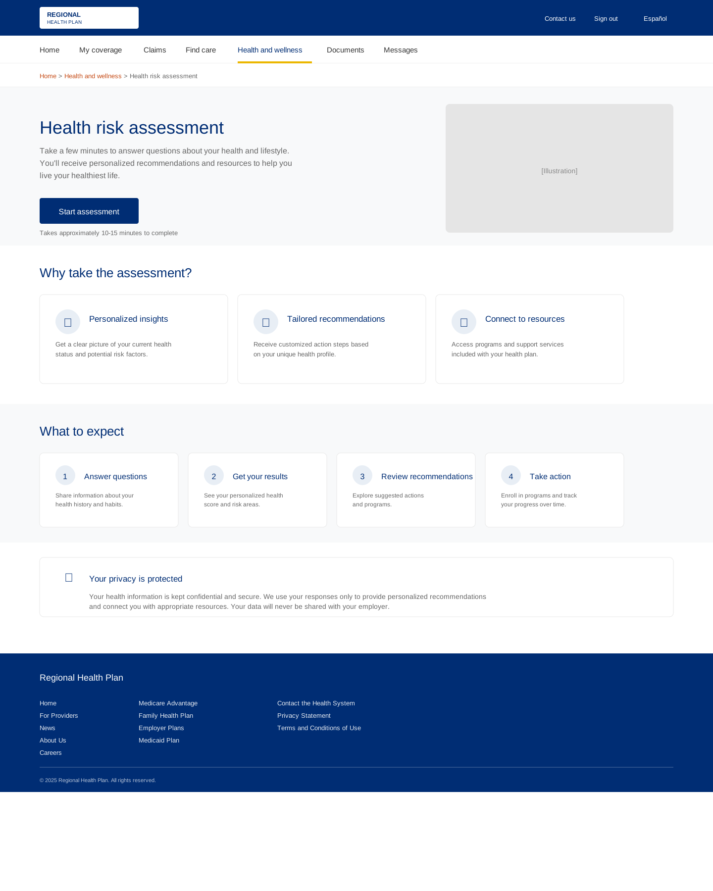
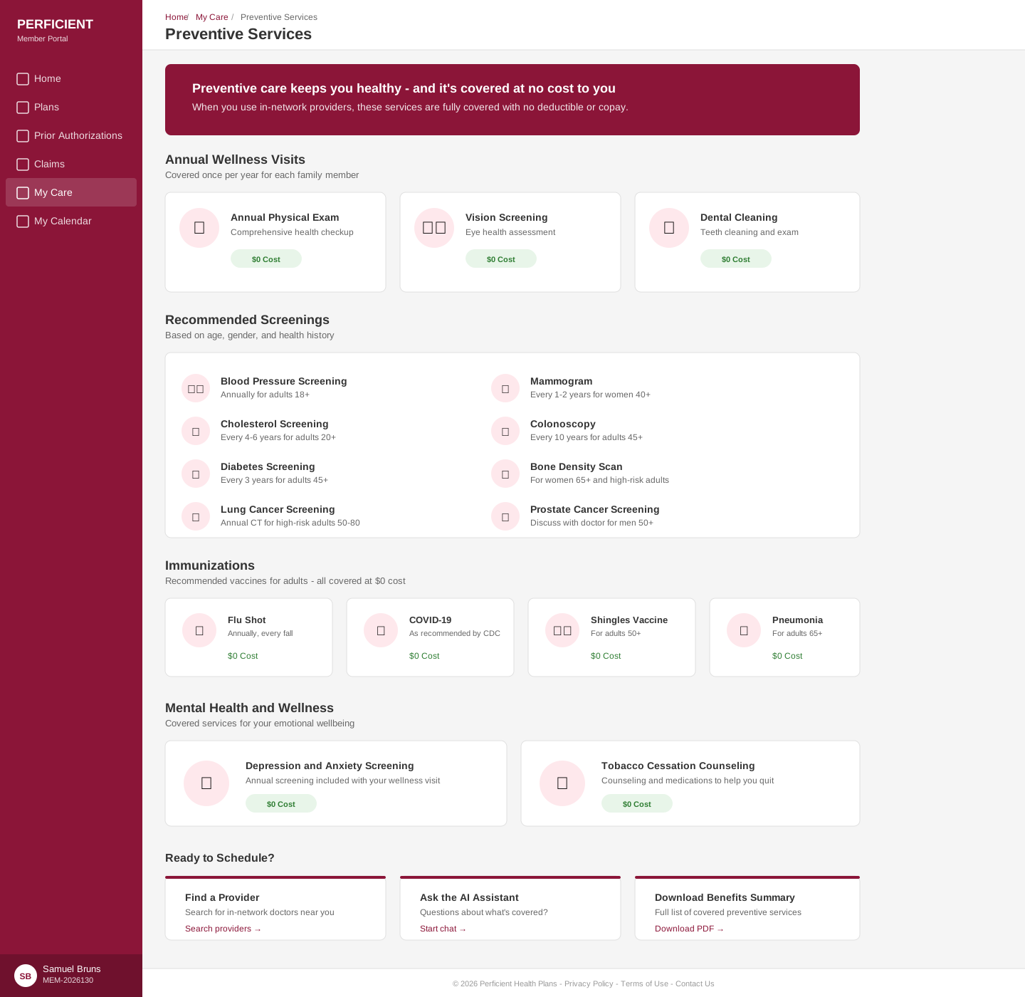
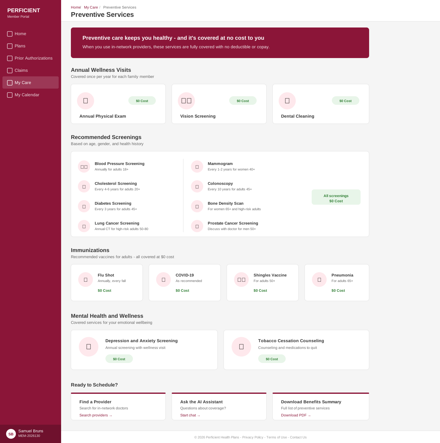
Health & Wellness: Preventive care is how health plans keep members healthy and costs down. I designed a wellness landing page, class finder, and health risk assessment flow that made preventive care feel inviting rather than clinical.
Plan Documents & Benefits: The most legally constrained content on the portal. My approach was to design a presentation layer that adds hierarchy, scannability, and plain-language summaries on top of the regulatory content, without altering the source material.
Every page was designed as a responsive pair: desktop at 1440px and mobile at 375px. The responsive strategy wasn't just "stack the columns"—I redesigned the information hierarchy for each viewport, recognizing that mobile users are often in a different context than desktop users.


Perficient Health Plans: The Platform Pattern
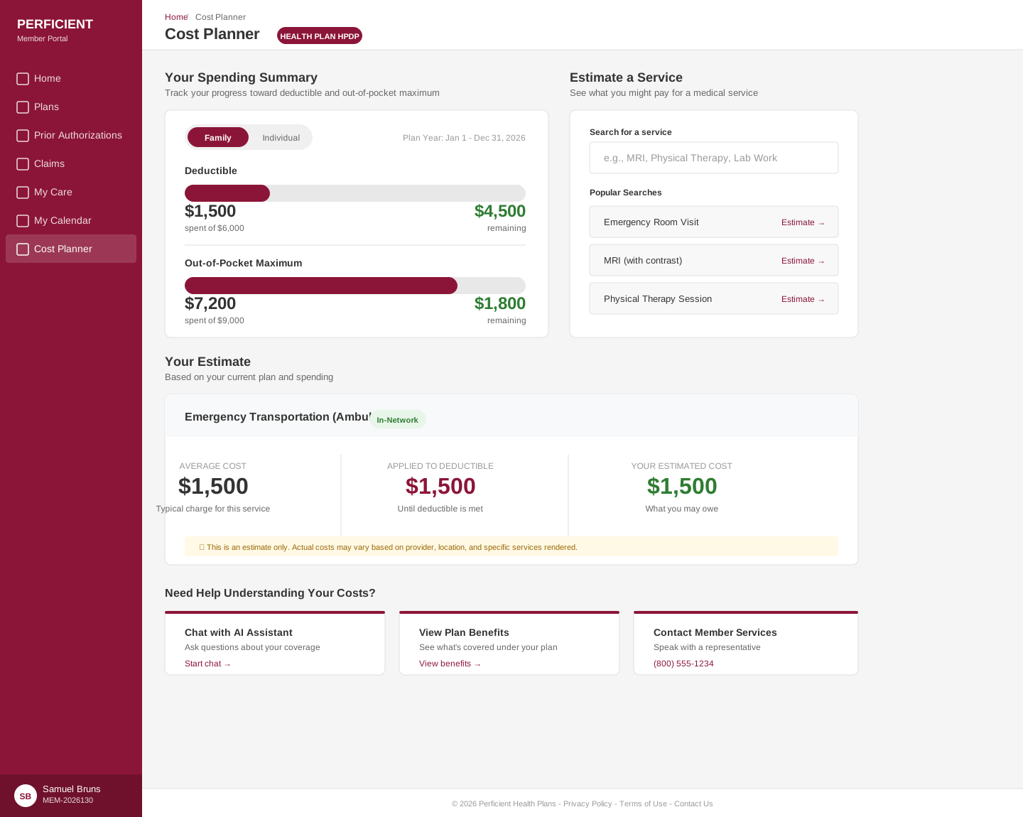
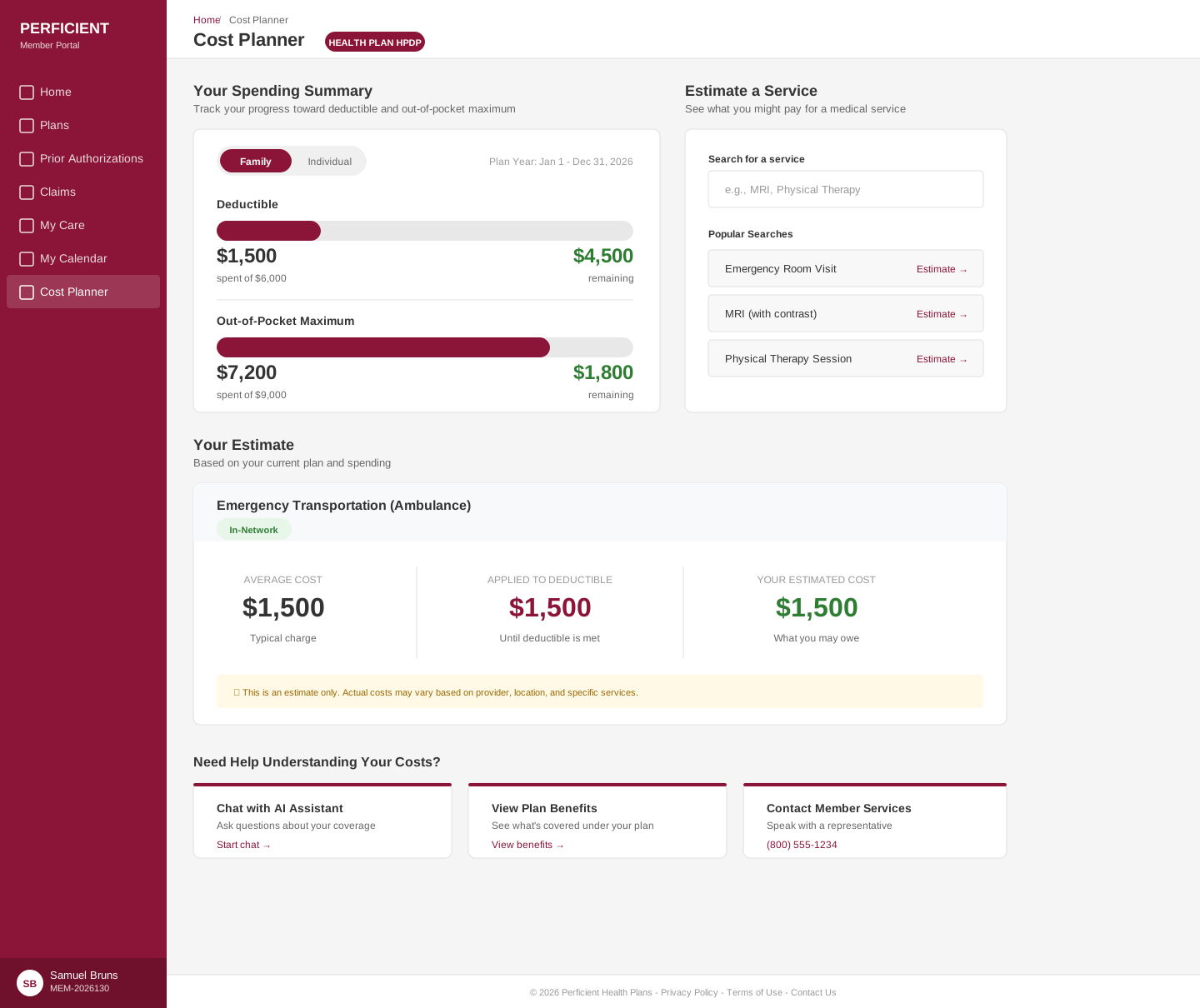
The Perficient-branded health plan work abstracted the patterns I'd refined on the health plan portal into a more generalizable platform. This was less about a single client's needs and more about identifying the universal patterns that any health plan portal needs: the authenticated homepage, claims and EOBs, plan comparison, provider directory integration. Each time I designed for these, I got closer to what I'd now consider the "right" answer for health plan portal UX.
Appian Healthcare: The Enterprise Layer
The Appian engagement added a dimension: building health plan workflows on an enterprise low-code platform. This introduced technical constraints that influenced design decisions—what components are available in Appian's design system, how data flows through their process automation, where custom design is possible versus where platform conventions must be followed.
Designing within platform constraints is its own skill. It requires understanding what the platform does well and leveraging those strengths, while finding creative solutions for the gaps.
The Pattern That Emerged
Across these three engagements, a clear set of principles crystallized:
- Task-oriented navigation over content-oriented navigation. Members don't think in terms of "plan documents." They think in terms of "I need to find a form." Organizing by task rather than content type is the pattern I've converged on across three health-plan engagements — it matches how stakeholders described their members' needs and held up against competitive benchmarks.
- Progressive disclosure for complex content. Rather than simplifying (which risks inaccuracy) or dumping everything at once (which overwhelms), layer it: a plain-language summary up front, with the ability to drill into full detail.
- Responsive design as context design. Mobile and desktop aren't just different screen sizes—they're different use contexts. A member on their phone in a doctor's office needs quick access to their ID card. A member at home is more likely reviewing claims.
- Trust through clarity. Health plan members are often skeptical. The portal design has to earn trust through extreme clarity—no jargon without explanation, no actions without clear consequences, no dead ends without help.
What I Learned
Three iterations of the same product type reinforced that repetition isn't redundancy — it's refinement. The health plan patterns informed the Perficient platform. The Perficient platform revealed what was essential versus decorative. The Appian work forced me to think about design as a system that lives within technical constraints. Each engagement gave me new insight into what works — and the confidence to push back when stakeholders defaulted to patterns that had already failed in a previous engagement.
I didn't design health plan portals because they were exciting — I designed them because they matter to millions of people who deserve to understand their healthcare.