I ran a Figma Make page through the checklist Foresee used to hire me in 2011
In November 2011 I was trying to get a job as a usability auditor at Foresee, and the interview was a mock audit. I picked a Gap product page — a men's hoodie — and worked it against a spreadsheet of twelve indicators with a column for Pass or Fail. I gave the Gap five fails out of twelve and got the job. I still have the spreadsheet.
I gave Figma Make a plain brief — a provider search results page for a regional health system, patients searching by specialty and location, filters, a results list with provider cards, a map/list toggle, desktop — and then ran what came back through the same twelve indicators.
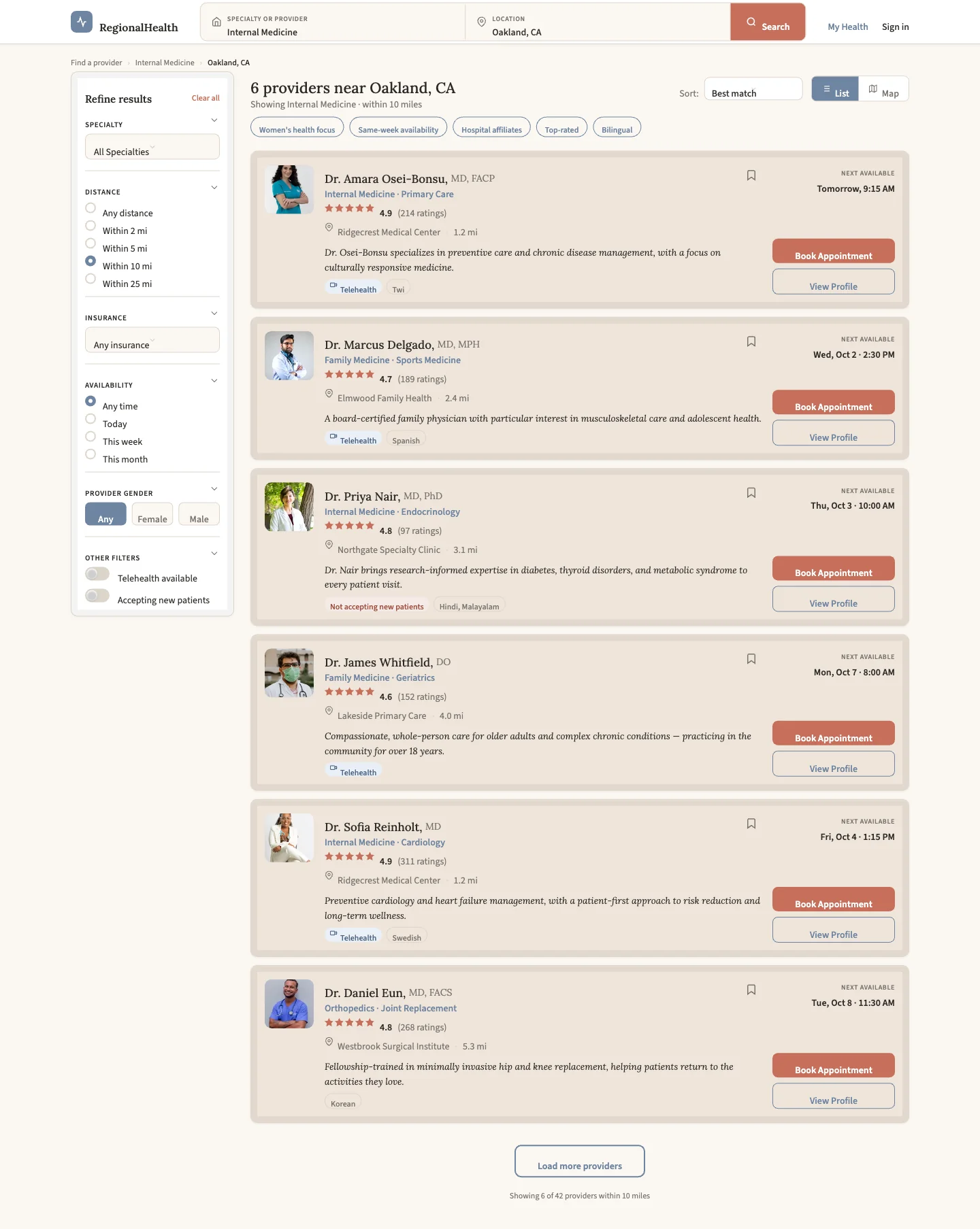
I want to be clear about the setup, because it matters. This was not an adversarial prompt. It's the kind of one-line brief a PM sends on a Tuesday. Make asked me to pick a visual style from a menu (I chose one called "Humanist Care," which came with a paragraph of rules including a list of things it would never do, such as "ruled journal lines"), thought for three minutes and seven seconds, and produced nearly 700 lines of React and a page that looks like this.
What it got right
More than I expected, and I want to say that first because the rest of this is going to sound harsh.
The card is structurally correct. Name and credentials, specialty and subspecialty, star rating with a review count, practice name and distance, a one-line bio, availability tags, and — on the right, where your eye lands — the next available appointment and a Book button. That right column is where the decision actually gets made. Make put it in the right place without being told.
The page has a real empty state. It has a sticky header and a sticky filter sidebar. Filter sections collapse. There's a breadcrumb. There's a bookmark. The "not accepting new patients" case is handled with a visible tag rather than hidden. The color choices are calm and the type hierarchy is legible at a glance.
If a junior designer handed me this as a first pass, I'd say good start. It looked like a pretty good first attempt.
The twelve indicators
Foresee's indicators were written for retail product pages, so a couple don't map perfectly, and I've noted where. I graded the way I would have in 2011: Pass means a patient can get through it, not that it's good.
- 1 Pass
It should be clear to customers the page they are on.
Pass"6 providers near Oakland, CA," a breadcrumb, and a subtitle. No ambiguity.
- 2 Fail
Breadcrumb trails must be effectively executed.
FailThere's a breadcrumb — Find a provider › Internal Medicine › Oakland, CA — and none of the three segments is a link. They're styled text. It also says Internal Medicine while the results include Family Medicine and Orthopedics.
- 3 Pass
Information must be effectively layered using bullets, tabs, etc.
PassFilter sections collapse. Cards layer name → specialty → rating → location → summary → tags in a sensible order.
- 4 Fail
Labeling and messaging should be clear, descriptive, contextual, and conventional.
FailThe headline says "Showing Internal Medicine." Two of the six results are Family Medicine and one is Orthopedics. The subtitle says "within 10 miles" and keeps saying it when you select "Within 2 mi." The languages tag on the first card just says "Twi" — no label, so a patient doesn't know it's a language. A quick-filter chip called "Hospital affiliates" means nothing to anyone. And you can type Dermatology into the search box and the subtitle will change to "Showing Dermatology" above six results that don't include a dermatologist.
- 5 Fail
Text must be appropriately sized and used.
FailFilter section labels are 11px uppercase. The "Next available" label is 10px. The search field labels are 10px. This is a find-a-doctor tool — the median user is older than the median web user, and in 2011 I failed the Gap on exactly this point.
- 6 Pass
Page elements should be sized appropriately.
PassPhotos at 72px, buttons at a comfortable height, chevrons at 16px. One caveat: the filter radio buttons are 16px — small for this audience — and they aren't real radio inputs (see #12).
- 7 Pass
Screen real estate must be used effectively.
Pass1280px container, 240px sidebar, cards fill the rest. No dead zones. The card's right column earns its space.
- 8 Fail
All critical information must be provided.
FailThe question every patient asks first — do you take my insurance — is not on the card. The data is there; every provider has an insurance array. The card never renders it. You can filter by insurance (which doesn't work, see #12) but you cannot see it.
- 9 Fail
Images must offer sufficient detail.
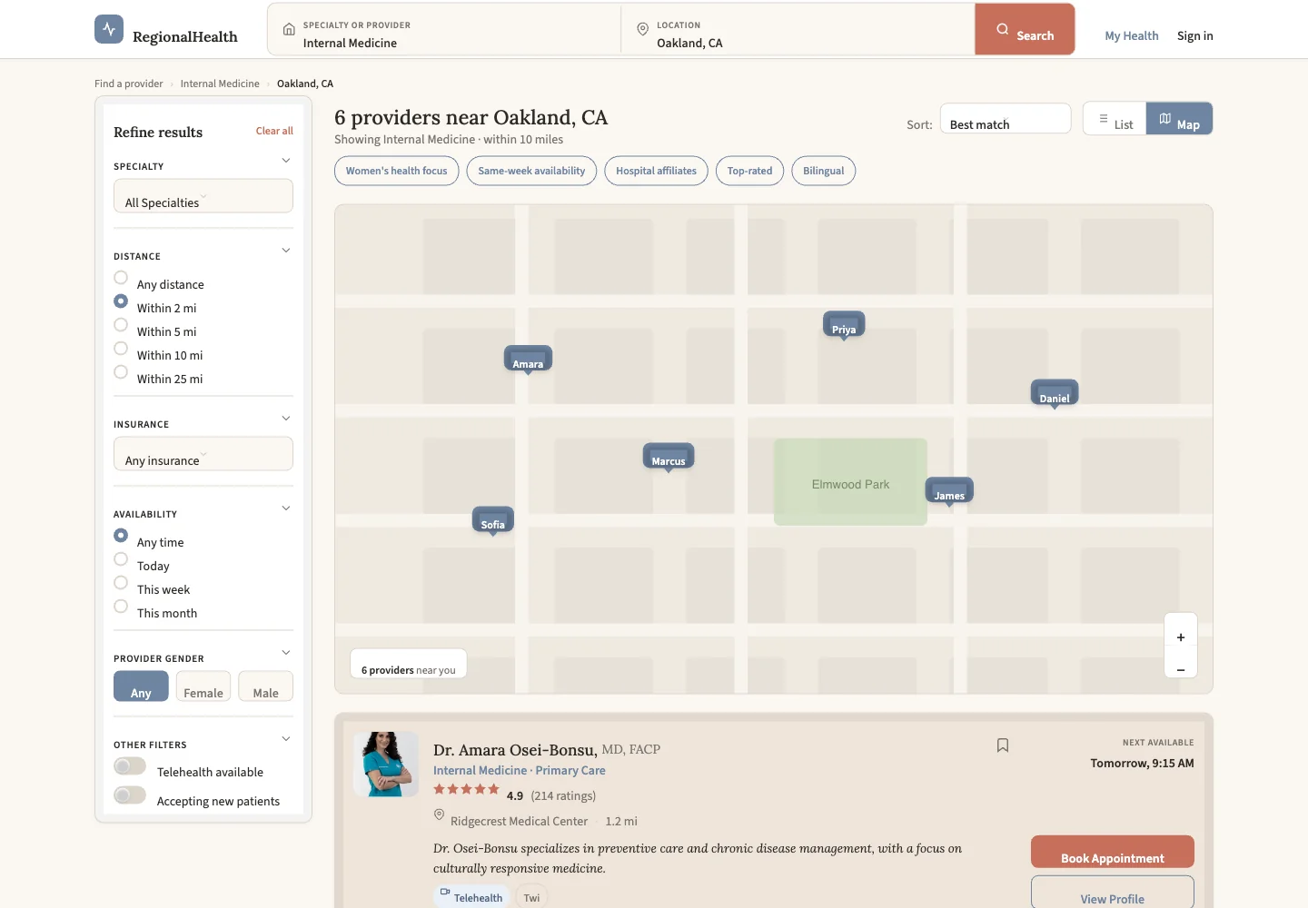
FailThe headshots are fine. The map is not a map — I didn't realize it was supposed to be one at first. It's an SVG of a grid with a park labeled "Elmwood Park," and six pins placed at hardcoded percentages that have nothing to do with the cards. Two of the doctors share an address — same building on Ridgecrest Blvd, suites 310 and 420 — and the map puts them at opposite corners. The zoom buttons have no handlers.
- 10 N/A
Customers must be able to easily browse items in the same category from product pages.
N/AThis is a results page, not a detail page. The closest equivalents here — the five quick-filter chips and "Load more providers" — do nothing when clicked.
- 11 Pass
Action mechanisms should be conventionally and prominently located.
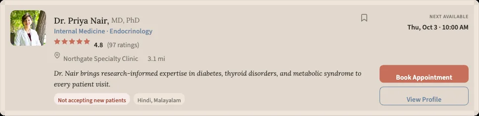
PassBook Appointment is the strongest color on the page, in the right column, on every card. Search is in the header. Conventional and prominent. Except that Dr. Nair's card says "Not accepting new patients" directly above a Book Appointment button.
- 12 Fail
Clicking on a link should take customers to the expected location.
FailSee below.
Six failures out of eleven graded. The Gap got five out of twelve in 2011, and the Gap's page worked.
The one that matters
Indicator 12 is the whole story.
I counted. Here is what actually does something on this page: the specialty dropdown, the three gender buttons, the two toggle switches, the list/map toggle, the bookmark icon, and Clear all. That's it.
Here is what doesn't: the distance filter, the insurance filter, the availability filter, the sort dropdown, all five quick-filter chips, Load more, the map zoom, Book Appointment, View Profile, the Search button, all three breadcrumb segments, and both nav links. I selected "Within 2 mi" with six providers on screen ranging from 1.2 to 5.3 miles. Six providers stayed on screen. I set insurance to Medicare. Six. I sorted by rating. Same order.
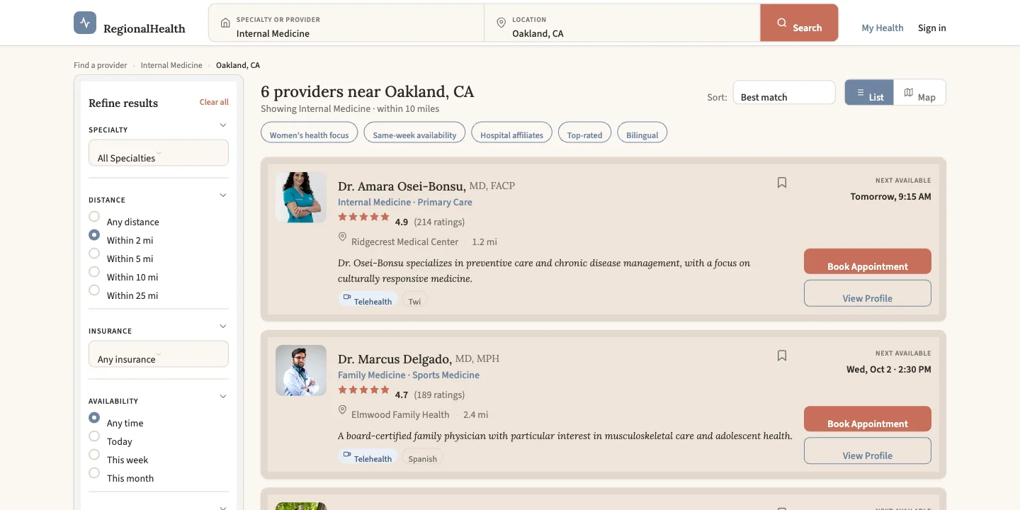
None of this is visible. Every dead control has a hover state, a focus ring, a transition. The radio buttons animate when you click them. They just don't filter anything, because they aren't radio buttons — they're divs with a click handler that sets a state variable nothing reads.
This is the part I keep coming back to. The polish isn't neutral. A page with unstyled dead links reads as unfinished. This page reads as finished. A stakeholder would look at it and see something eighty percent done. It's about thirty percent done, and the rest is superficial polish that doesn't actually improve the substance.
The pattern
If you sort the twelve grades by what they require, they split cleanly.
Everything that's a generic web pattern passed. Sticky header, collapsible sections, empty state, card hierarchy, container width, button placement. Make knows what a results page looks like. It's seen a million of them.
Everything that requires knowing something about a patient failed. Insurance on the card. Text size for a 68-year-old. Whether a doctor who isn't accepting patients should have a Book button. Whether the headline should agree with the results under it. None of those is a layout problem. They're all the same problem, which is that the tool doesn't know what someone is doing on this page, so it can't tell which details are load-bearing.
The headline is the tell. "Showing Internal Medicine" sits directly above a Family Medicine doctor. A human designer catches that in the first review because they read their own headline. The tool wrote the headline in one place and the results in another and never read them together. That's not a bug you fix with a better prompt. It's what happens when nothing in the process is asking would this make sense to the person using it.
What I'd do with it
The same thing I did with the Gap page. A heuristic pass takes about thirty minutes and it's the difference between "looks done" and "is done." The order I'd fix things: put insurance on the card, make the headline agree with the results, wire the filters, get the labels above 12px, and either build a real map or take the toggle off. Then it's a first pass, and a decent one.
That's the honest read. These tools are getting the skeleton right, fast. What they can't yet do is the part of the job that was never about the skeleton.
Method notes: brief given to Figma Make on September 13, 2026, "Humanist Care" style selected from Make's menu, no follow-up prompts. Page evaluated at 1440px in the running preview and from the generated source. Indicators are Foresee Results' twelve-point mock audit rubric, 2011. Grading is mine.